Visualization Exercise (Module 5)
Introduction
The following exercise is for Module 5 in Dr. Andreas Handel’s MADA Course.
I am recreating the first figure reflected in FiveThirtyEight’s article entitled, “The Rise of Terrorism Inspired By Religion In France.” It previous deaths due to terrorism in France as well as the European Union from 1972 - 2014. The following code is an additive process as each element of the figure is replicated.
Source article can be found here
Required Packages
The following R packages are required for this exercise:
- here: for path definition
- dplyr: for data wrangling
- ggplot2: for data plotting
- data.table: for converting data frames to data tables (and vice versa)
Import data
The first step was to download the data from the FiveThirtyEight GitHub repository and import it.
#define path to EU data
data_location_1 <- here::here("data","eu_terrorism_fatalities_by_country.csv")

#load EU data
EU_rawdata <- utils::read.csv(data_location_1, stringsAsFactors = FALSE)
Clean EU data
I first added a total fatalities column to the data, and then I converted it to the long format. It took a couple tries before I realized that I needed to convert the country columns to numeric, as they were imported as numeric. I then filtered the data to select only the France and total fatalities.
#create total column
EU_processeddata <- EU_rawdata %>%
                      dplyr::mutate(Total = rowSums(.[2:13]))

#look at structure of df
utils::str(EU_processeddata)
## 'data.frame': 45 obs. of 14 variables:
## $ iyear : int 1970 1971 1972 1973 1974 1975 1976 1977 1978 1979 ...
## $ Belgium : int 0 0 0 0 0 0 0 0 1 1 ...
## $ Denmark : int 0 0 0 0 0 0 0 0 0 0 ...
## $ France : int 0 0 1 5 3 3 7 3 21 11 ...
## $ Germany : int 0 0 0 0 0 0 0 0 0 0 ...
## $ Greece : int 2 0 0 5 92 1 14 1 0 1 ...
## $ Ireland : int 1 1 6 4 34 7 5 2 1 9 ...
## $ Italy : int 0 0 1 62 26 0 10 25 21 24 ...
## $ Luxembourg : int 0 0 0 0 0 0 0 0 0 0 ...
## $ Netherlands : int 0 0 0 1 1 4 0 9 1 3 ...
## $ Portugal : int 0 0 0 0 0 0 3 0 0 3 ...
## $ Spain : int 0 0 2 6 19 31 17 44 84 112 ...
## $ United.Kingdom: int 20 110 368 210 234 245 264 103 81 133 ...
## $ Total : num 23 111 378 293 409 291 320 187 210 297 ...#need to convert all numeric columns to numeric (not integers)
EU_processeddata[, 2:13] <- lapply(EU_processeddata[,2:13], as.numeric)
#recheck structure of df
utils::str(EU_processeddata)## 'data.frame': 45 obs. of 14 variables:
## $ iyear : int 1970 1971 1972 1973 1974 1975 1976 1977 1978 1979 ...
## $ Belgium : num 0 0 0 0 0 0 0 0 1 1 ...
## $ Denmark : num 0 0 0 0 0 0 0 0 0 0 ...
## $ France : num 0 0 1 5 3 3 7 3 21 11 ...
## $ Germany : num 0 0 0 0 0 0 0 0 0 0 ...
## $ Greece : num 2 0 0 5 92 1 14 1 0 1 ...
## $ Ireland : num 1 1 6 4 34 7 5 2 1 9 ...
## $ Italy : num 0 0 1 62 26 0 10 25 21 24 ...
## $ Luxembourg : num 0 0 0 0 0 0 0 0 0 0 ...
## $ Netherlands : num 0 0 0 1 1 4 0 9 1 3 ...
## $ Portugal : num 0 0 0 0 0 0 3 0 0 3 ...
## $ Spain : num 0 0 2 6 19 31 17 44 84 112 ...
## $ United.Kingdom: num 20 110 368 210 234 245 264 103 81 133 ...
## $ Total : num 23 111 378 293 409 291 320 187 210 297 ...#set as data table
data.table::setDT(EU_processeddata)
#convert to long format
EU_processeddata_long <- data.table::melt(data = EU_processeddata,
id.vars = "iyear",
variable.name = "country",
value.name = "fatalities")
#select only France and Total country values
chart_data <- dplyr::filter(EU_processeddata_long, country %in% c("France", "Total"))Default Area Chart
The first visualization step was to create the default area chart generated by the ggplot2 package.
#with defaults only
ggplot2::ggplot(chart_data, aes(x = iyear, y = fatalities, fill = country))+
          geom_area()
Initial Customizations
I started with adjusting the immediately obvious changes: reordering the categories, hiding the legend, adding a title, changing the background of the plot area, and changing the colors.
#reorder so France shows up on the bottom of stack
ggplot2::ggplot(chart_data, aes(x = iyear, y = fatalities, fill = factor(country, levels = c("Total", "France"))))+
          geom_area()
#add title and hide legend
ggplot2::ggplot(chart_data, aes(x = iyear, y = fatalities, fill = factor(country, levels = c("Total", "France")))) +
          geom_area(show.legend = FALSE) +
          labs( x = "", y = "",
              title ="Previous Terrorism Deaths in France And The EU",
              subtitle = "Europen Union member countries as of 1986") +
          theme(
            plot.title = element_text(hjust = -0.15, vjust = 0, face = "bold"),
            plot.subtitle = element_text(hjust = -0.1, vjust = 0))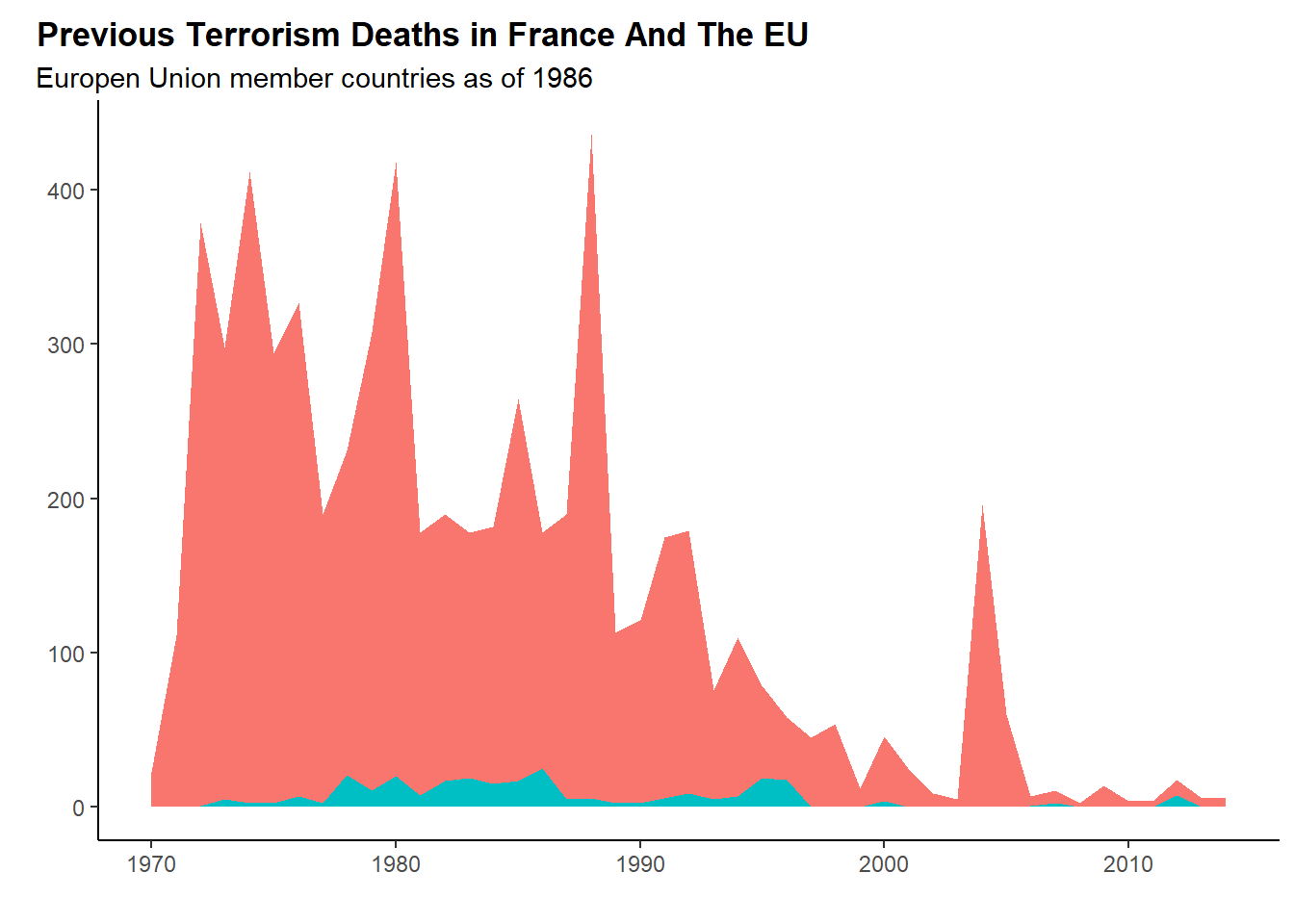
#adjusting background of plot to match
ggplot2::ggplot(chart_data, aes(x = iyear, y = fatalities, fill = factor(country, levels = c("Total", "France")))) +
          geom_area(show.legend = FALSE) +
          labs( x = "", y = "",
              title ="Previous Terrorism Deaths in France And The EU",
              subtitle = "Europen Union member countries as of 1986") +
          theme(
              panel.grid.minor.x = element_blank(),
              panel.grid.minor.y = element_blank(),
              panel.grid.major = element_line(colour = "#cccccc"),
              plot.background = element_rect(fill = "#EBEBEB"),
              plot.title = element_text(hjust = -0.15, vjust = 0, face = "bold"),
              plot.subtitle = element_text(hjust = -0.1, vjust = 0))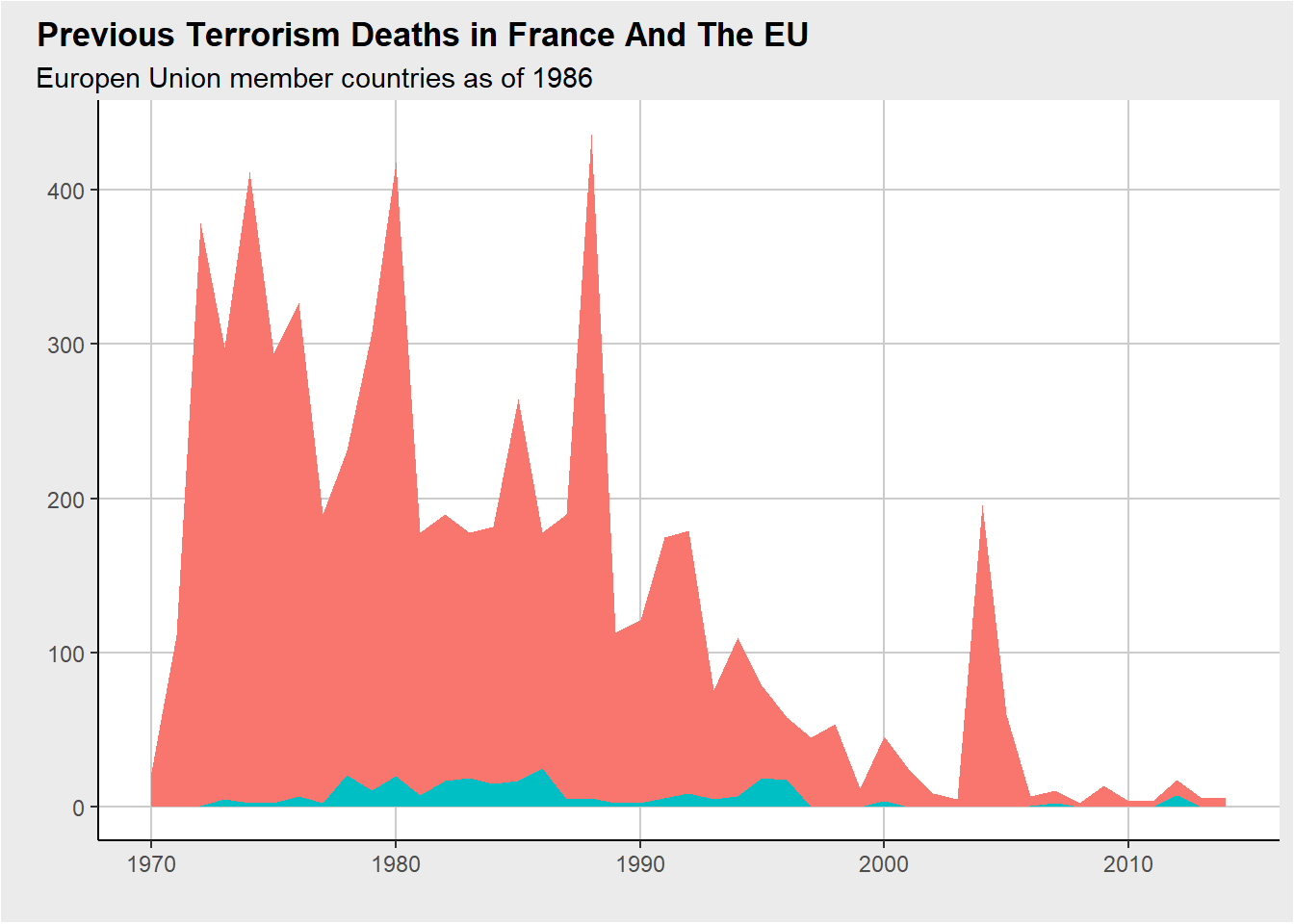
#change colors
ggplot2::ggplot(chart_data, aes(x = iyear, y = fatalities, fill = factor(country, levels = c("Total", "France")))) +
          geom_area(show.legend = FALSE) +
          scale_fill_manual(values = c("#ffa999","#ff2700")) +
          labs( x = "", y = "",
              title ="Previous Terrorism Deaths in France And The EU",
              subtitle = "Europen Union member countries as of 1986") +
          theme(
              panel.grid.minor.x = element_blank(),
              panel.grid.minor.y = element_blank(),
              panel.grid.major = element_line(colour = "#cccccc"),
              plot.background = element_rect(fill = "#EBEBEB"),
              plot.title = element_text(hjust = -0.15, vjust=0, face = "bold"),
              plot.subtitle = element_text(hjust = -0.1, vjust = 0))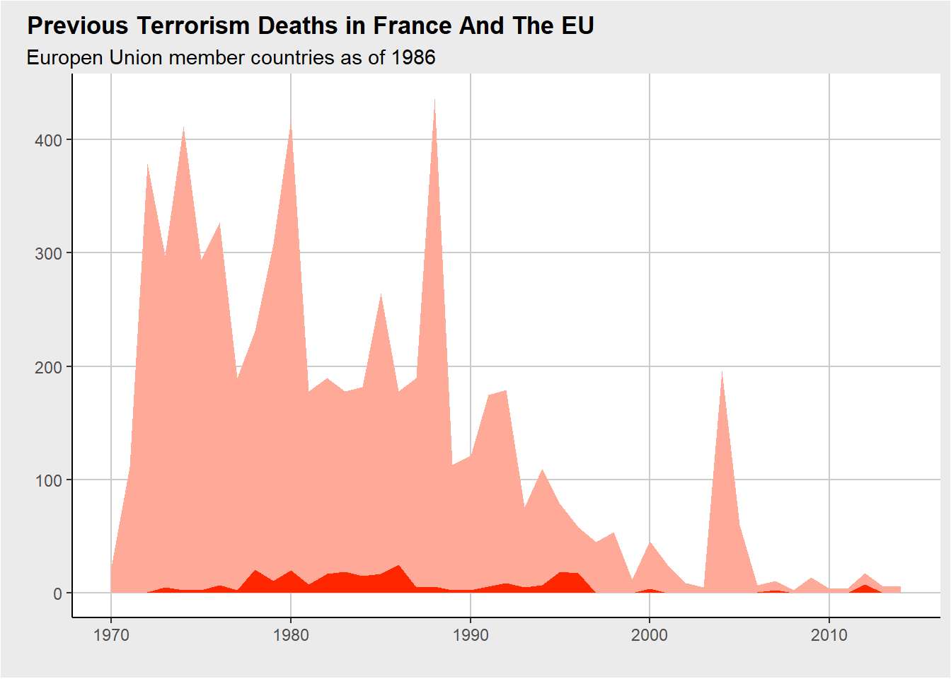
Add Labels
This step adds the text overlay labels. The arrow was tricky to get right, and I never did figure out how they completed a filled head arrow instead of an open one. The masterminds at Stack Overflow were incredibly helpful as I looked through old answers to understand how to adjust the arrow.
#add France and EU labels
ggplot2::ggplot(chart_data, aes(x = iyear, y = fatalities, fill = factor(country, levels = c("Total", "France")))) +
          geom_area(show.legend = FALSE) +
          scale_fill_manual(values = c("#ffa999","#ff2700")) +
          annotate("text", x = 1980, y = 50,
                   label = "France",
                   color = "#ff2700",
                   size = 4.5,
                   fontface = 2) +
          annotate("text", x = 1989, y = 350,
                   label = "European \nUnion",
                   color = "#ffa999",
                   size = 4.5,
                   fontface = 2,
                   hjust = 0) +
          labs( x = "", y = "",
              title ="Previous Terrorism Deaths in France And The EU",
              subtitle = "Europen Union member countries as of 1986") +
          theme(
              panel.grid.minor.x = element_blank(),
              panel.grid.minor.y = element_blank(),
              panel.grid.major = element_line(colour = "#cccccc"),
              plot.background = element_rect(fill = "#EBEBEB"),
              plot.title = element_text(hjust = -0.15, vjust=0, face = "bold"),
plot.subtitle = element_text(hjust = -0.1, vjust = 0)) 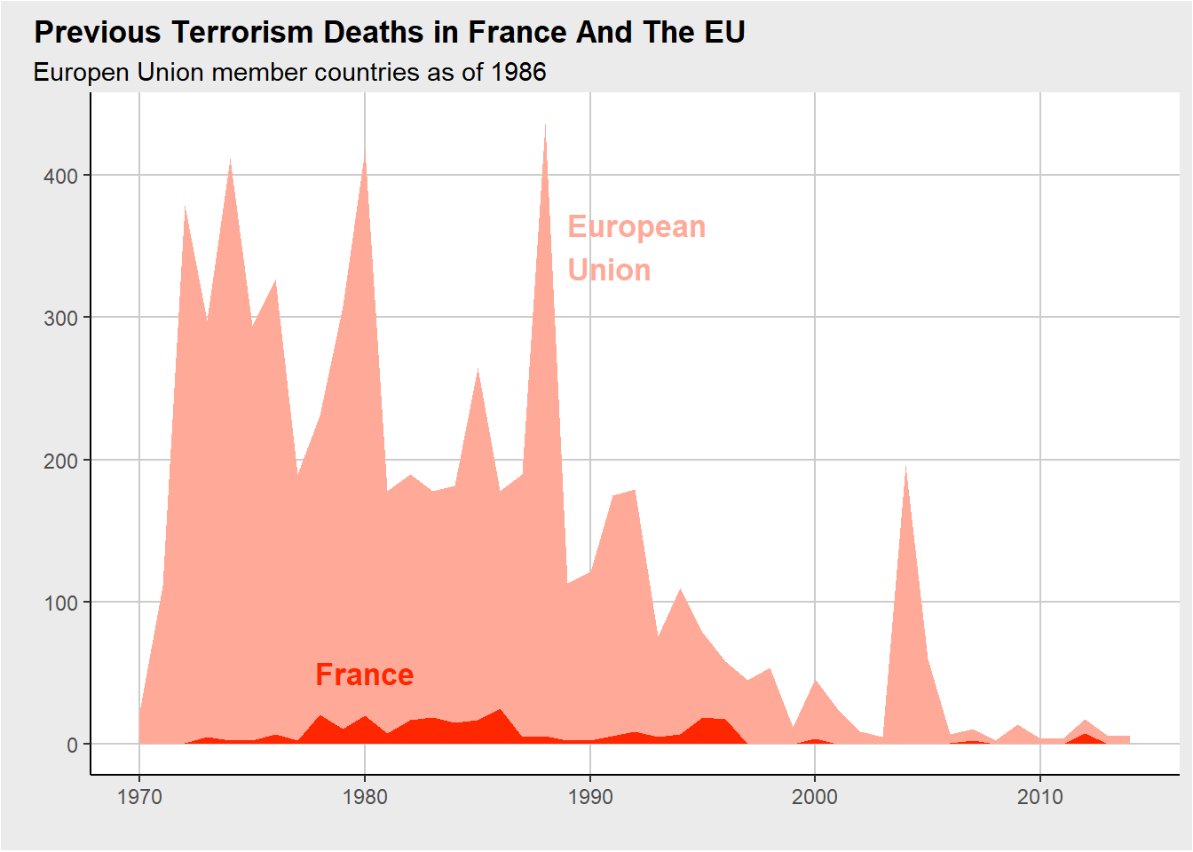
#add Madrid train bombings label
ggplot2::ggplot(chart_data, aes(x = iyear, y = fatalities, fill = factor(country, levels = c("Total", "France")))) +
          geom_area(show.legend = FALSE) +
          scale_fill_manual(values = c("#ffa999","#ff2700")) +
          annotate("text", x = 1980, y = 50,
                   label = "France",
                   color = "#ff2700",
                   size = 4.5,
                   fontface = 2) +
          annotate("text", x = 1989, y = 350,
                   label = "European \nUnion",
                   color = "#ffa999",
                   size = 4.5,
                   fontface = 2,
                   hjust = 0) +
          annotate("text", x = 2004, y = 255,
                   label = "2004 Madrid \ntrain bombings",
                   color = "black",
                   size = 4,
                   hjust = 0.5) +
          geom_segment(aes(x = 2004, xend = 2004, y = 220, yend = 200),
                       color = "black",
                       arrow = arrow(length = unit(0.2, "cm"))) +
          labs( x = "", y = "",
              title ="Previous Terrorism Deaths in France And The EU",
              subtitle = "Europen Union member countries as of 1986") +
          theme(
              panel.grid.minor.x = element_blank(),
              panel.grid.minor.y = element_blank(),
              panel.grid.major = element_line(colour = "#cccccc"),
              plot.background = element_rect(fill = "#EBEBEB"),
              plot.title = element_text(hjust = -0.15, vjust=0, face = "bold"),
plot.subtitle = element_text(hjust = -0.1, vjust = 0)) 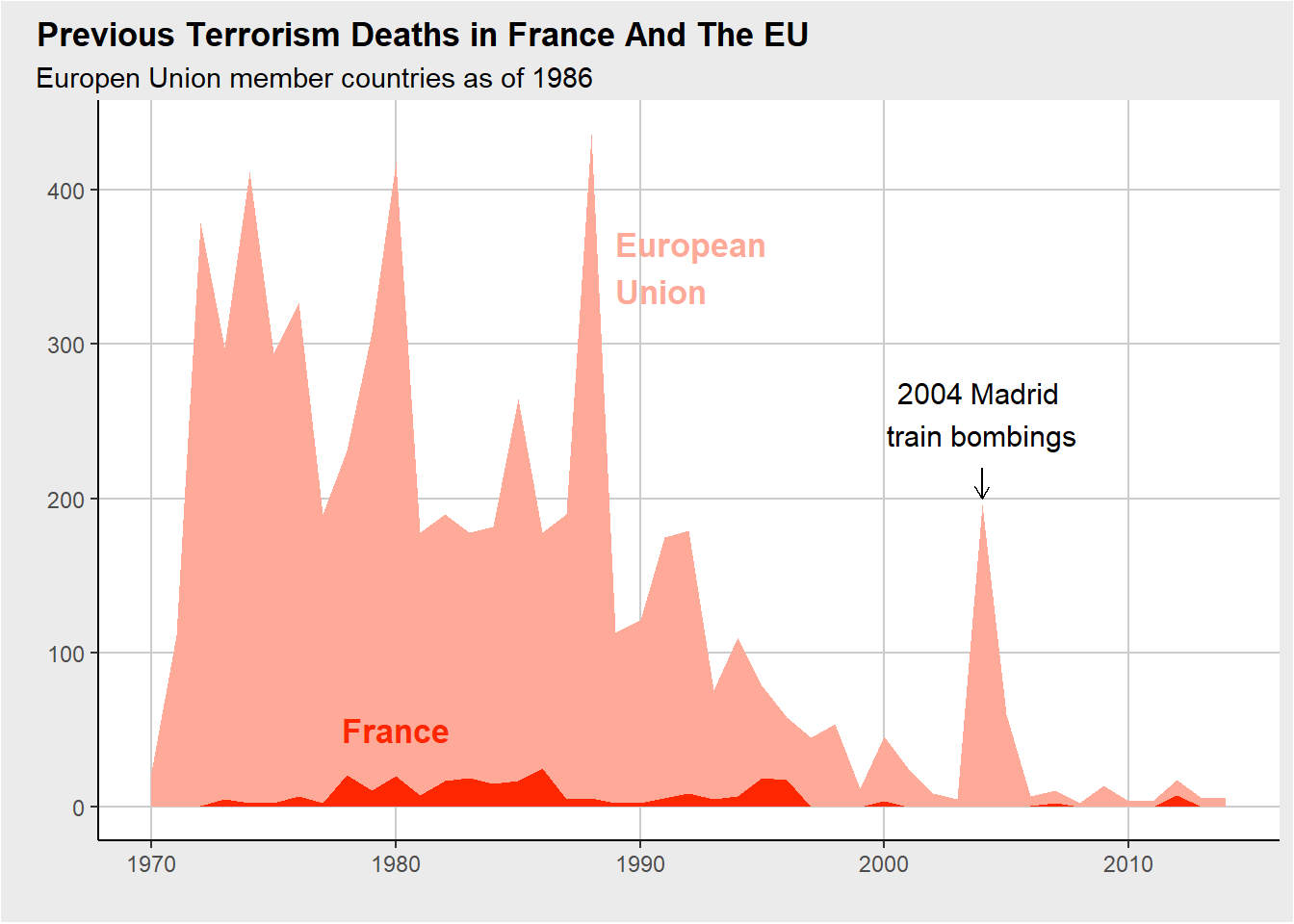
Fixing the Axes and Final Adjustments
This proved to be the trickiest step. I considered using the scales library to automatically overlay the x-axis labels. However, date formatting will always be my Achilles’ heel in coding. I never managed to figure out how to convert the year variable to a date format that the scales library accepted. Instead, I just added new labels, adjusted the origin location, and fidgeted with the plot themes to make the final adjustments.
#fix axes
ggplot2::ggplot(chart_data, aes(x = iyear, y = fatalities, fill = factor(country, levels = c("Total", "France")))) +
          geom_area(show.legend = FALSE) +
          scale_fill_manual(values = c("#ffa999","#ff2700")) +
          scale_y_continuous(expand = c(0, 0), limits = c(0, NA)) +
          scale_x_continuous(breaks = seq(1970, 2014, by = 5),
                labels = c("1970", "'75", "'80", "'85", "'90", "'95", "2000", "'05", "'10")) +
          annotate("text", x = 1980, y = 50,
                   label = "France",
                   color = "#ff2700",
                   size = 4.5,
                   fontface = 2) +
          annotate("text", x = 1989, y = 350,
                   label = "European \nUnion",
                   color = "#ffa999",
                   size = 4.5,
                   fontface = 2,
                   hjust = 0) +
          annotate("text", x = 2004, y = 255,
                   label = "2004 Madrid \ntrain bombings",
                   color = "black",
                   size = 4,
                   hjust = 0.5) +
          geom_segment(aes(x = 2004, xend = 2004, y = 220, yend = 200),
                       color = "black",
                       arrow = arrow(length = unit(0.2, "cm"))) +
          labs( x = "", y = "",
              title ="Previous Terrorism Deaths in France And The EU",
              subtitle = "Europen Union member countries as of 1986") +
          theme(
              panel.grid.minor.x = element_blank(),
              panel.grid.minor.y = element_blank(),
              panel.grid.major = element_line(colour = "#cccccc"),
              plot.background = element_rect(fill = "#EBEBEB"),
              axis.line.x = element_line(color="#5b5e5f", size = 0.5),
              axis.ticks.length = unit(0.25, "cm"),
              axis.ticks = element_line(colour = "#cccccc"),
              axis.text=element_text(size=12),
              plot.title = element_text(hjust = -0.35, vjust=0, face = "bold", size = 16),
              plot.subtitle = element_text(hjust = -0.15, vjust = 0, size = 14))
Final Product
This is the final figure generated by the code to replicate FiveThirtyEight’s article.
ggplot2::ggplot(chart_data, aes(x = iyear, y = fatalities, fill = factor(country, levels = c("Total", "France")))) +
          geom_area(show.legend = FALSE) +
          scale_fill_manual(values = c("#ffa999","#ff2700")) +
          scale_y_continuous(expand = c(0, 0), limits = c(0, NA)) +
          scale_x_continuous(breaks = seq(1970, 2014, by = 5),
                labels = c("1970", "'75", "'80", "'85", "'90", "'95", "2000", "'05", "'10")) +
          annotate("text", x = 1980, y = 50,
                   label = "France",
                   color = "#ff2700",
                   size = 4.5,
                   fontface = 2) +
          annotate("text", x = 1989, y = 350,
                   label = "European \nUnion",
                   color = "#ffa999",
                   size = 4.5,
                   fontface = 2,
                   hjust = 0) +
          annotate("text", x = 2004, y = 255,
                   label = "2004 Madrid \ntrain bombings",
                   color = "black",
                   size = 4,
                   hjust = 0.5) +
          geom_segment(aes(x = 2004, xend = 2004, y = 220, yend = 200),
                       color = "black",
                       arrow = arrow(length = unit(0.2, "cm"))) +
          labs( x = "", y = "",
              title ="Previous Terrorism Deaths in France And The EU",
              subtitle = "Europen Union member countries as of 1986") +
          theme(
              panel.grid.minor.x = element_blank(),
              panel.grid.minor.y = element_blank(),
              panel.grid.major = element_line(colour = "#cccccc"),
              plot.background = element_rect(fill = "#EBEBEB"),
              axis.line.x = element_line(color="#5b5e5f", size = 0.5),
              axis.ticks.length = unit(0.25, "cm"),
              axis.ticks = element_line(colour = "#cccccc"),
              axis.text=element_text(size=12),
              plot.title = element_text(hjust = -0.35, vjust=0, face = "bold", size = 16),
              plot.subtitle = element_text(hjust = -0.15, vjust = 0, size = 14))