Introduction
This exercise focuses on conducting exploratory data analysis from the influenza data.
The raw data for this exercise comes from the following citation: McKay, Brian et al. (2020), Virulence-mediated infectiousness and activity trade-offs and their impact on transmission potential of patients infected with influenza, Dryad, Dataset, https://doi.org/10.5061/dryad.51c59zw4v.
The processed data was produced on the Data Processing tab.
Within this analysis, the main continuous outcome of interest is body temperature and the main categorical outcome of interest is nausea. For each symptom, we will do the following steps:
- Produce and print some numerical output (e.g. table, summary statistics)
- Create a histogram or density plot (continuous variables only)
- Scatterplot, boxplot, or other similar plots against the main outcome of interest
- Any other exploration steps that may be useful.
For each variable, the EDA steps will be labeled by the numbers listed above.
Required Packages
The following R packages are required for this exercise:
- here: for path setting
- tidyverse: for all packages in the Tidyverse (ggplot2, dyplr, tidyr, readr, purr, tibble, stringr, forcats)
- summarytools: for overall dataframe summary
- ggplot2: for plotting data
- car: for creating QQ plots
- table1: for creating tables for summary statistics / other numerical outputs
- scales: for percent calculation
- margrittr: for sequential piping
Load Processed Data
Load the data created on the Data Processing page.
# path to data
# note the use of the here() package and not absolute paths
data_location <- here::here("data","flu","processeddata.rds")

# load data using the "ReadRDS" function in base R.
processeddata <- base::readRDS(data_location)

# create a mirror dataset to avoid manipulating the cleaned dataset
EDAdata <- processeddata
Data Overview
To better understand the processed data, let’s use summarytools to visualize the dataframe.
summarytools::dfSummary(EDAdata)
## Data Frame Summary
## Dimensions: 730 x 32
## Duplicates: 0
##
## -----------------------------------------------------------------------------------------------------------------
## No   Variable            Stats / Values           Freqs (% of Valid)   Graph                 Valid      Missing
## ---- ------------------- ------------------------ -------------------- --------------------- ---------- ---------
## 1    SwollenLymphNodes   1. No                    418 (57.3%)          IIIIIIIIIII           730        0
##      [factor]            2. Yes                   312 (42.7%)          IIIIIIII              (100.0%)   (0.0%)
##
## 2    ChestCongestion     1. No                    323 (44.2%)          IIIIIIII              730        0
##      [factor]            2. Yes                   407 (55.8%)          IIIIIIIIIII           (100.0%)   (0.0%)
##
## 3    ChillsSweats        1. No                    130 (17.8%)          III                   730        0
##      [factor]            2. Yes                   600 (82.2%)          IIIIIIIIIIIIIIII      (100.0%)   (0.0%)
##
## 4    NasalCongestion     1. No                    167 (22.9%)          IIII                  730        0
##      [factor]            2. Yes                   563 (77.1%)          IIIIIIIIIIIIIII       (100.0%)   (0.0%)
##
## 5    CoughYN             1. No                     75 (10.3%)          II                    730        0
##      [factor]            2. Yes                   655 (89.7%)          IIIIIIIIIIIIIIIII     (100.0%)   (0.0%)
##
## 6    Sneeze              1. No                    339 (46.4%)          IIIIIIIII             730        0
##      [factor]            2. Yes                   391 (53.6%)          IIIIIIIIII            (100.0%)   (0.0%)
##
## 7    Fatigue             1. No                     64 ( 8.8%)          I                     730        0
##      [factor]            2. Yes                   666 (91.2%)          IIIIIIIIIIIIIIIIII    (100.0%)   (0.0%)
##
## 8    SubjectiveFever     1. No                    230 (31.5%)          IIIIII                730        0
##      [factor]            2. Yes                   500 (68.5%)          IIIIIIIIIIIII         (100.0%)   (0.0%)
##
## 9    Headache            1. No                    115 (15.8%)          III                   730        0
##      [factor]            2. Yes                   615 (84.2%)          IIIIIIIIIIIIIIII      (100.0%)   (0.0%)
##
## 10   Weakness            1. None                   49 ( 6.7%)          I                     730        0
##      [factor]            2. Mild                  223 (30.5%)          IIIIII                (100.0%)   (0.0%)
##                          3. Moderate              338 (46.3%)          IIIIIIIII
##                          4. Severe                120 (16.4%)          III
##
## 11   WeaknessYN          1. No                     49 ( 6.7%)          I                     730        0
##      [factor]            2. Yes                   681 (93.3%)          IIIIIIIIIIIIIIIIII    (100.0%)   (0.0%)
##
## 12   CoughIntensity      1. None                   47 ( 6.4%)          I                     730        0
##      [factor]            2. Mild                  154 (21.1%)          IIII                  (100.0%)   (0.0%)
##                          3. Moderate              357 (48.9%)          IIIIIIIII
##                          4. Severe                172 (23.6%)          IIII
##
## 13   CoughYN2            1. No                     47 ( 6.4%)          I                     730        0
##      [factor]            2. Yes                   683 (93.6%)          IIIIIIIIIIIIIIIIII    (100.0%)   (0.0%)
##
## 14   Myalgia             1. None                   79 (10.8%)          II                    730        0
##      [factor]            2. Mild                  213 (29.2%)          IIIII                 (100.0%)   (0.0%)
##                          3. Moderate              325 (44.5%)          IIIIIIII
##                          4. Severe                113 (15.5%)          III
##
## 15   MyalgiaYN           1. No                     79 (10.8%)          II                    730        0
##      [factor]            2. Yes                   651 (89.2%)          IIIIIIIIIIIIIIIII     (100.0%)   (0.0%)
##
## 16   RunnyNose           1. No                    211 (28.9%)          IIIII                 730        0
##      [factor]            2. Yes                   519 (71.1%)          IIIIIIIIIIIIII        (100.0%)   (0.0%)
##
## 17   AbPain              1. No                    639 (87.5%)          IIIIIIIIIIIIIIIII     730        0
##      [factor]            2. Yes                    91 (12.5%)          II                    (100.0%)   (0.0%)
##
## 18   ChestPain           1. No                    497 (68.1%)          IIIIIIIIIIIII         730        0
##      [factor]            2. Yes                   233 (31.9%)          IIIIII                (100.0%)   (0.0%)
##
## 19   Diarrhea            1. No                    631 (86.4%)          IIIIIIIIIIIIIIIII     730        0
##      [factor]            2. Yes                    99 (13.6%)          II                    (100.0%)   (0.0%)
##
## 20   EyePn               1. No                    617 (84.5%)          IIIIIIIIIIIIIIII      730        0
##      [factor]            2. Yes                   113 (15.5%)          III                   (100.0%)   (0.0%)
##
## 21   Insomnia            1. No                    315 (43.2%)          IIIIIIII              730        0
##      [factor]            2. Yes                   415 (56.8%)          IIIIIIIIIII           (100.0%)   (0.0%)
##
## 22   ItchyEye            1. No                    551 (75.5%)          IIIIIIIIIIIIIII       730        0
##      [factor]            2. Yes                   179 (24.5%)          IIII                  (100.0%)   (0.0%)
##
## 23   Nausea              1. No                    475 (65.1%)          IIIIIIIIIIIII         730        0
##      [factor]            2. Yes                   255 (34.9%)          IIIIII                (100.0%)   (0.0%)
##
## 24   EarPn               1. No                    568 (77.8%)          IIIIIIIIIIIIIII       730        0
##      [factor]            2. Yes                   162 (22.2%)          IIII                  (100.0%)   (0.0%)
##
## 25   Hearing             1. No                    700 (95.9%)          IIIIIIIIIIIIIIIIIII   730        0
##      [factor]            2. Yes                    30 ( 4.1%)                                (100.0%)   (0.0%)
##
## 26   Pharyngitis         1. No                    119 (16.3%)          III                   730        0
##      [factor]            2. Yes                   611 (83.7%)          IIIIIIIIIIIIIIII      (100.0%)   (0.0%)
##
## 27   Breathless          1. No                    436 (59.7%)          IIIIIIIIIII           730        0
##      [factor]            2. Yes                   294 (40.3%)          IIIIIIII              (100.0%)   (0.0%)
##
## 28   ToothPn             1. No                    565 (77.4%)          IIIIIIIIIIIIIII       730        0
##      [factor]            2. Yes                   165 (22.6%)          IIII                  (100.0%)   (0.0%)
##
## 29   Vision              1. No                    711 (97.4%)          IIIIIIIIIIIIIIIIIII   730        0
##      [factor]            2. Yes                    19 ( 2.6%)                                (100.0%)   (0.0%)
##
## 30   Vomit               1. No                    652 (89.3%)          IIIIIIIIIIIIIIIII     730        0
##      [factor]            2. Yes                    78 (10.7%)          II                    (100.0%)   (0.0%)
##
## 31   Wheeze              1. No                    510 (69.9%)          IIIIIIIIIIIII         730        0
##      [factor]            2. Yes                   220 (30.1%)          IIIIII                (100.0%)   (0.0%)
##
## 32   BodyTemp            Mean (sd) : 98.9 (1.2)   57 distinct values     :                   730        0
##      [numeric]           min < med < max:                                : :                 (100.0%)   (0.0%)
##                          97.2 < 98.5 < 103.1                             : :
##                          IQR (CV) : 1.1 (0)                              : : :
##                                                                        : : : : : . . .   .
## -----------------------------------------------------------------------------------------------------------------
Looking at the data summary, there are multiple variables for the same symptom (e.g. category and presence). Additionally, several of the categorical variables have an uneven proportion distribution, and BodyTemp appears to have some skew as well.
The outcome variables of interest were specified as part of the MADA course, so what predictor varaibles may be relevant?
- The data is about influenza, so certainly symptoms commonly associated with influeza (e.g. runny nose, nasal congestion, chills / sweating, and myalgia).
- Since we are interested in nausea, we should also probably include nausea and vomiting (co-presentation).
Main Continuous Outcome of Interest: Body Temperature
# start with main continuous outcome of interest: body temperature
# (1) since it is continuous, we can calculate summary statistics with the base summary function
base::summary(EDAdata$BodyTemp)
##    Min. 1st Qu.  Median    Mean 3rd Qu.    Max.
##   97.20   98.20   98.50   98.94   99.30  103.10
# (2) create a density plot for body temperature
ggplot2::ggplot(data = EDAdata, aes(x = BodyTemp)) +
  geom_density()
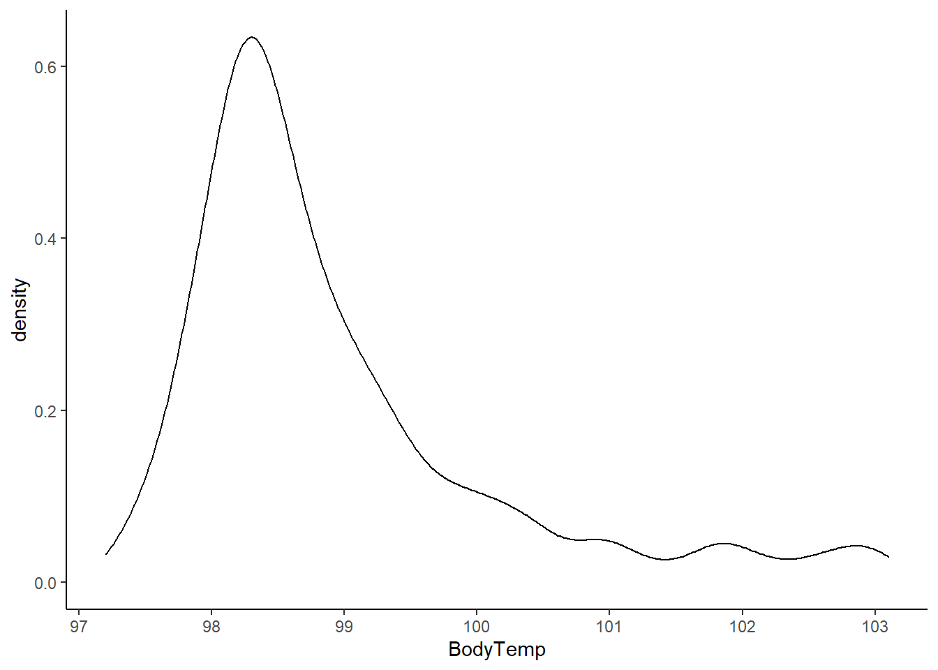
# looking at the histogram and summary statistics, there appears to be a left skew from a normal distribution
# (3) create a boxplot to better visualize
# since body temperature is the main outcome of interest, no need to plot it against anything
ggplot2::ggplot(data = EDAdata, aes(y = BodyTemp)) +
  geom_boxplot()
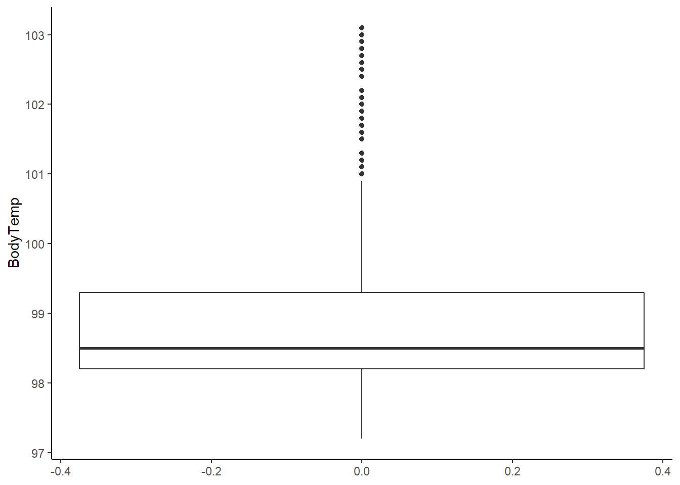
# there is clearly a skew in the data towards normal body temperature (98.6F)
# choosing to keep the points in the 101 - 103 F range as these are clinically reasonable values for influenza patients
# in other words, they are unlikely to be clinically  significant outliers

# it is still worth examining the normality assumption, especially since we are moving to linear model fitting next
# (4) create a QQ-plot for body temperature
car::qqPlot(EDAdata$BodyTemp)
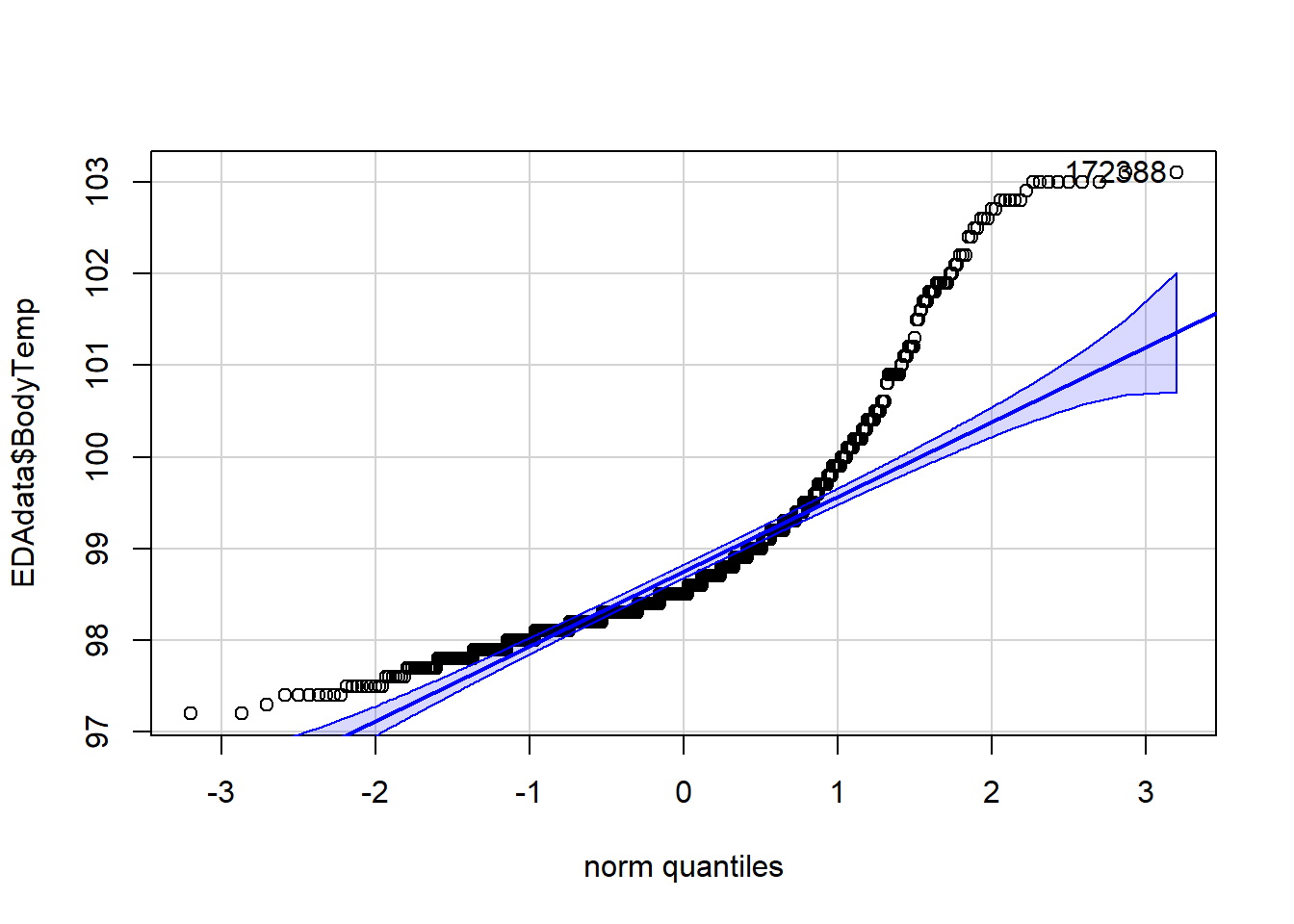
## [1] 172 388
# this clearly shows the body temperature data violates the normality assumption for linear models
Looking at the histogram and summary statistics, there appears to be a left skew from a normal distribution. The QQ plot further affirms a violation of the normality assumption. All of the values of body temperature are within clinically reasonable bounds for influenza (likely febrile) patients.
Main Categorical Outcome of Interest: Nausea
# now move onto main categorical outcome of interest: nausea
# before any analysis, create a label for nausea so outputs are more interpretable
EDAdata$Nausea <- base::factor(processeddata$Nausea, levels = c("No", "Yes"), labels = c("Nausea Absent", "Nausea Present"))

# (1) since it is categorical, we can only examine frequency and proportions of the variable
# this can be done with the summary tools package function "freq" and options to hide NAs (removed during processing)
summarytools::freq(EDAdata$Nausea, report.nas = FALSE)
## Frequencies
##
##                        Freq        %   % Cum.
## -------------------- ------ -------- --------
##        Nausea Absent    475    65.07    65.07
##       Nausea Present    255    34.93   100.00
##                Total    730   100.00   100.00
# (2) skip as nausea is not a continuous variable

# (3) as this is a main outcome of interest, we can only create a bar plot in ggplot to illustrate distribution
# the two geom_text statements tell ggplot to calculate and display count and percentages at the top of each bar
ggplot2::ggplot(data = EDAdata, aes(x = Nausea)) +
  geom_bar() +
  geom_text(
    aes(label = after_stat(count)),
    stat = 'count',
    nudge_x = -0.06,
    nudge_y = 0.2,
    vjust = -1) +
  geom_text(
    aes(label = after_stat(scales::percent(prop, prefix = "(", suffix = "%)", accuracy = 0.1)), group = 1),
    stat = 'count',
    nudge_x = 0.06,
    nudge_y = 0.2,
    vjust = -1)
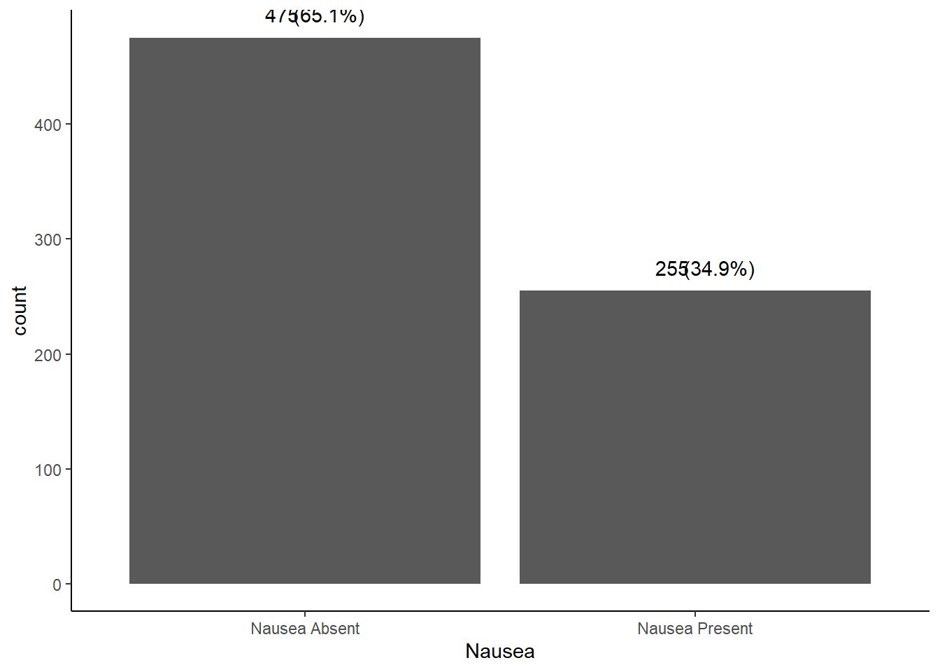
# it is almost a 2/3 vs 1/3 split for nausea in patients captured in this dataset
# there isn't much more descriptive work we can do here
The patients included in this dataset have an almost 2/3 vs 1/3 split for reports of nausea.
Predictor Variable: Runny Nose
# (1) since it is categorical, we can only examine frequency and proportions of the variable
# this can be done with the summary tools package function "freq" and options to hide NAs (removed during processing)
summarytools::freq(EDAdata$RunnyNose, report.nas = FALSE)
## Frequencies
##
##               Freq        %   % Cum.
## ----------- ------ -------- --------
##          No    211    28.90    28.90
##         Yes    519    71.10   100.00
##       Total    730   100.00   100.00
# almost 3/4 of the patients captured in the dataset had a runny nose

# (2) skip as runny nose is not a continuous variable

# (3) examine graphical relationship with outcomes
# start with body temperature (i.e. create a box plot)
# include a jitter function to have a better idea of number of measurements and distribution
ggplot2::ggplot(data = EDAdata, aes(x = RunnyNose, y = BodyTemp)) +
  geom_boxplot() +
  geom_jitter(alpha = 0.5, width = 0.2, height = 0.2, color = "tomato")
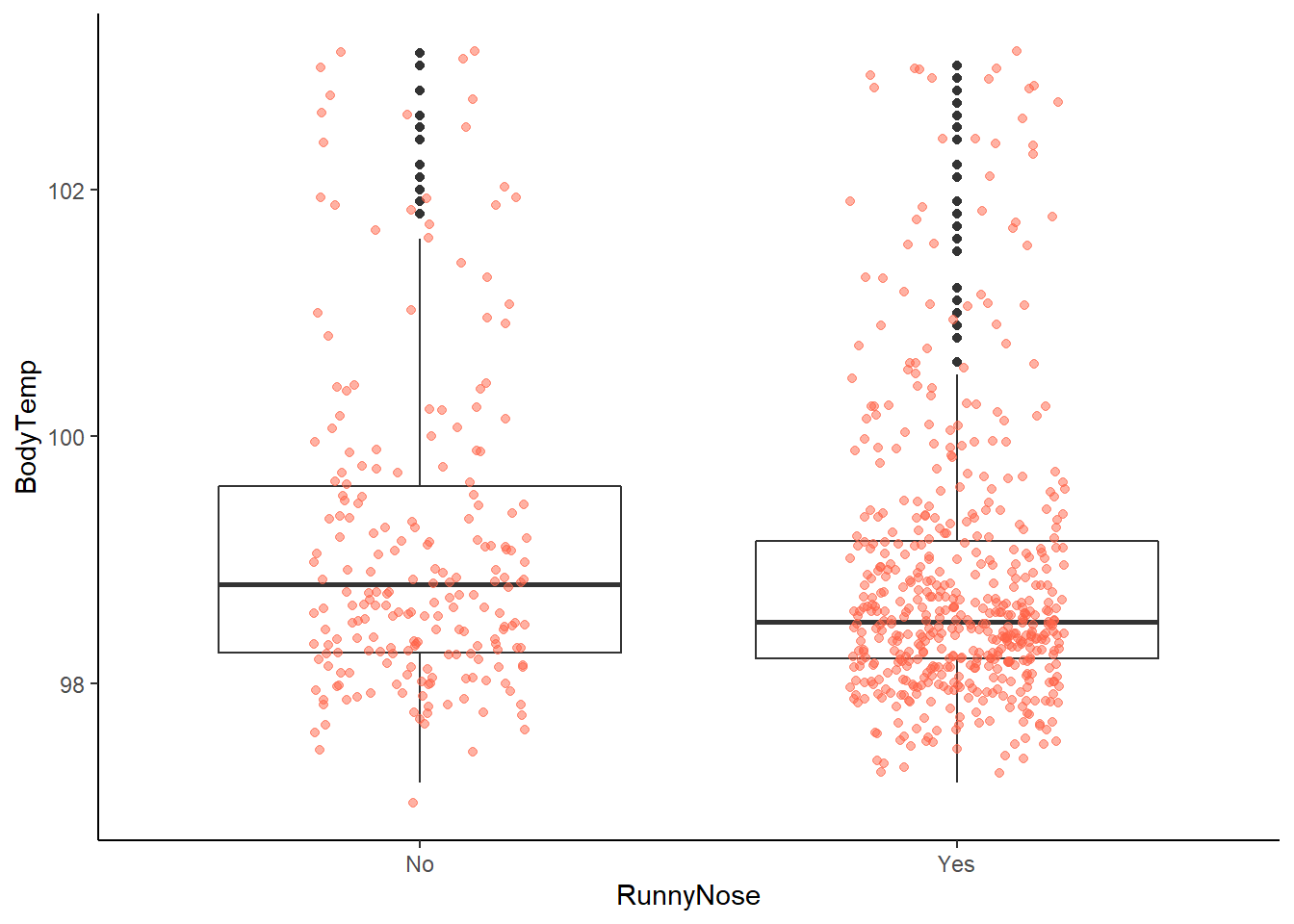
# looking at this graph, it appears that patients with runny nose are  potentially less likely to have a fever
# but this requires further analysis

# (3) now with nausea
# first create a table output of runny nose by nausea
# we can do this using the table 1 package
table1::label(EDAdata$RunnyNose) <- "Runny Nose"
table1::table1(~ RunnyNose | Nausea, data = EDAdata)
|
Nausea Absent
(N=475) |
Nausea Present
(N=255) |
Overall
(N=730) |
| Runny Nose |
|
|
|
| No |
139 (29.3%) |
72 (28.2%) |
211 (28.9%) |
| Yes |
336 (70.7%) |
183 (71.8%) |
519 (71.1%) |
# since both are categorical variables, we can use a stacked bar plot to understand the distribution of runny nose within nausea symptoms
# to be able to include the percentages within each group, we will to calculate percentages before creating a graph
# first need to define a sequential piping operator so the function knows to use objects defined in the operation
`%s>%` <- magrittr::pipe_eager_lexical

# the first part of this piping operation calculates the counts and percentages within the Nausea grouping
# the second part plots it using the ggplot2 package
# trying to visualize the proportion of runny nose patients report outcome of interest (nausea)
# spacing on the labels isn't ideal, so would need to adjust for an actual manuscript
EDAdata %s>%
  dplyr::group_by(RunnyNose, Nausea) %s>%
  dplyr::summarise(count_Nausea = n()) %s>%
  dplyr::group_by(RunnyNose) %s>%
  dplyr::mutate(count_RunnyNose = sum(count_Nausea)) %s>%
  dplyr::mutate(pct = count_Nausea / count_RunnyNose) %s>% {
    ggplot2::ggplot(., aes(x = RunnyNose,
                           y = count_Nausea,
                           fill = Nausea)) +
      ggplot2::geom_bar(
        position = "stack",
        stat = "identity") +
      ggplot2::geom_text(
        aes(label = count_Nausea),
        .,
        stat = 'identity',
        size = 4,
        position = position_stack(vjust = 0.7, reverse = FALSE)) +
      ggplot2::geom_text(
        aes(label = scales::percent(pct)),
        .,
        stat = 'identity',
        size = 4,
        position = position_stack(vjust = 0.5, reverse = FALSE)) +
      ggplot2::labs(.,
                    title = "Frequency of Nausea among Runny Nose Patients",
                    x = "Runny Nose?",
                    y = "Frequency of Nausea")
  }
## `summarise()` has grouped output by 'RunnyNose'. You can override using the `.groups` argument.
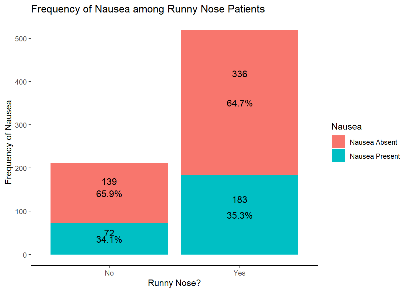
# looking at the results of this graph, it seems that the distribution of the nausea outcome isn't affected by the presence of a runny nose
Predictor Variable: Nasal Congestion
# (1) since it is categorical, we can only examine frequency and proportions of the variable
# this can be done with the summary tools package function "freq" and options to hide NAs (removed during processing)
summarytools::freq(EDAdata$NasalCongestion, report.nas = FALSE)
## Frequencies
##
##               Freq        %   % Cum.
## ----------- ------ -------- --------
##          No    167    22.88    22.88
##         Yes    563    77.12   100.00
##       Total    730   100.00   100.00
# more than 3/4 of the patients captured in the dataset had nasal congestion

# (2) skip as nasal congestion is not a continuous variable

# (3) examine graphical relationship with outcomes
# start with body temperature (i.e. create a box plot)
# include a jitter function to have a better idea of number of measurements and distribution
ggplot2::ggplot(data = EDAdata, aes(x = NasalCongestion, y = BodyTemp)) +
  geom_boxplot() +
  geom_jitter(alpha = 0.5, width = 0.2, height = 0.2, color = "tomato")
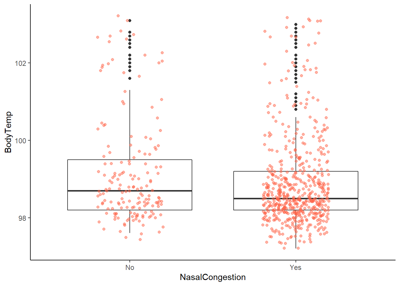
# looking at this graph, hard to tell potential difference
# likely due to totals in each group (yes = 563, no = 167)

# (3) now with nausea
# first create a table output of nasal congestion by nausea
# we can do this using the table 1 package
table1::label(EDAdata$NasalCongestion) <- "Nasal Congestion"
table1::table1(~ NasalCongestion | Nausea, data = EDAdata)
|
Nausea Absent
(N=475) |
Nausea Present
(N=255) |
Overall
(N=730) |
| Nasal Congestion |
|
|
|
| No |
120 (25.3%) |
47 (18.4%) |
167 (22.9%) |
| Yes |
355 (74.7%) |
208 (81.6%) |
563 (77.1%) |
# since both are categorical variables, we can use a stacked bar plot to understand the distribution of nausea and nasal congestion symptoms
# to be able to include the percentages within each group, we will to calculate percentages before creating a graph
# first need to define a sequential piping operator so the function knows to use objects defined in the operation
`%s>%` <- magrittr::pipe_eager_lexical

# the first part of this piping operation calculates the counts and percentages within the Nausea grouping
# the second part plots it using the ggplot2 package
# trying to visualize the proportion of nasal congestion patients report outcome of interest (nausea)
# spacing on the labels isn't ideal, so would need to adjust for an actual manuscript
EDAdata %s>%
  dplyr::group_by(NasalCongestion, Nausea) %s>%
  dplyr::summarise(count_Nausea = n()) %s>%
  dplyr::group_by(NasalCongestion) %s>%
  dplyr::mutate(count_NasalCongestion = sum(count_Nausea)) %s>%
  dplyr::mutate(pct = count_Nausea / count_NasalCongestion) %s>% {
    ggplot2::ggplot(., aes(x = NasalCongestion,
                           y = count_Nausea,
                           fill = Nausea)) +
      ggplot2::geom_bar(
        position = "stack",
        stat = "identity") +
      ggplot2::geom_text(
        aes(label = count_Nausea),
        .,
        stat = 'identity',
        size = 4,
        position = position_stack(vjust = 0.7, reverse = FALSE)) +
      ggplot2::geom_text(
        aes(label = scales::percent(pct)),
        .,
        stat = 'identity',
        size = 4,
        position = position_stack(vjust = 0.5, reverse = FALSE)) +
      ggplot2::labs(.,
                    title = "Frequency of Nausea among Nasal Congestion Patients",
                    x = "Nasal Congestion?",
                    y = "Frequency of Nausea")
  }
## `summarise()` has grouped output by 'NasalCongestion'. You can override using the `.groups` argument.
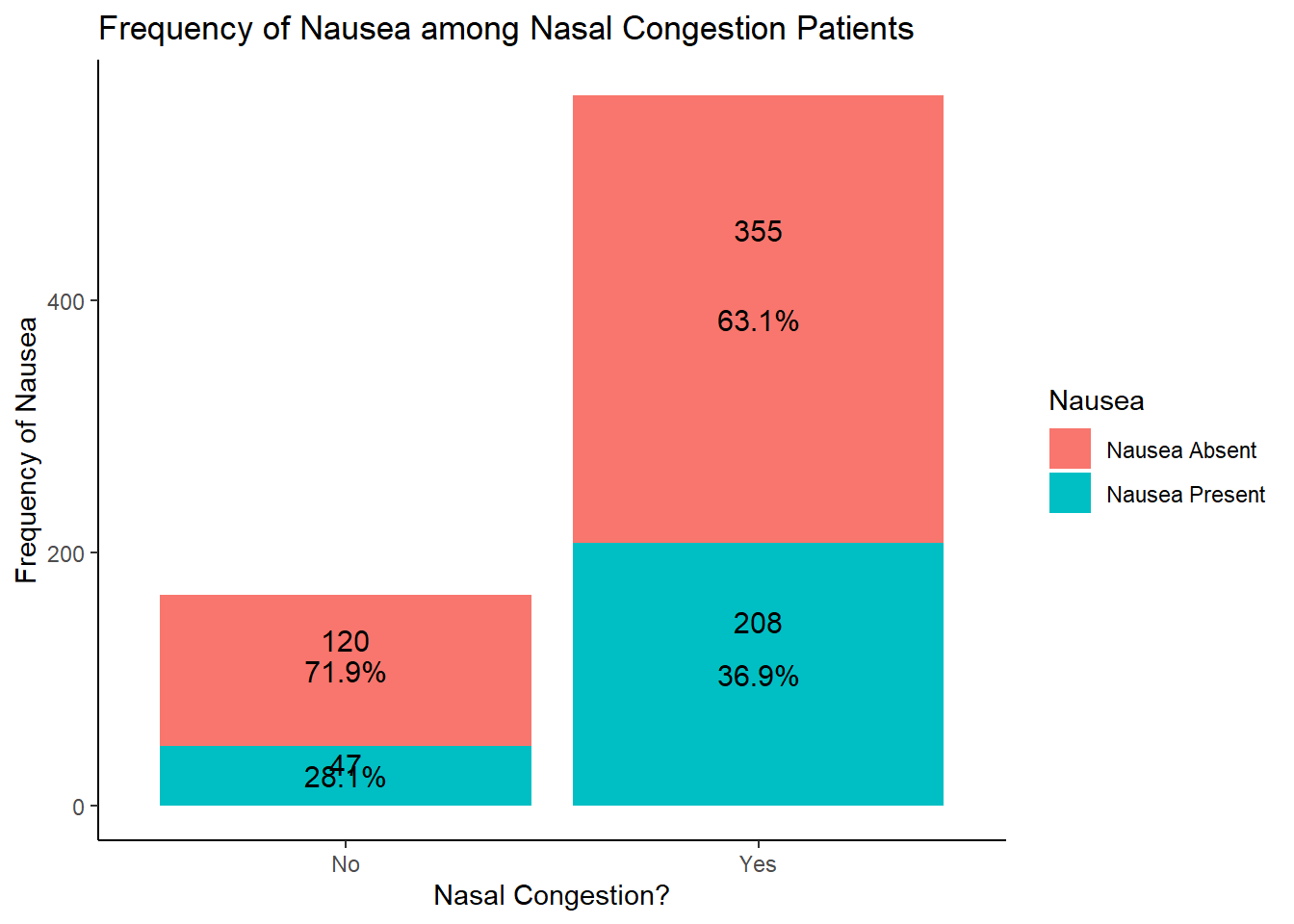
# looking at the results of this graph, potentially more likely to have nausea without nasal congestion
Predictor Variable: Pharyngitis
# (1) since it is categorical, we can only examine frequency and proportions of the variable
# this can be done with the summary tools package function "freq" and options to hide NAs (removed during processing)
summarytools::freq(EDAdata$Pharyngitis, report.nas = FALSE)
## Frequencies
##
##               Freq        %   % Cum.
## ----------- ------ -------- --------
##          No    119    16.30    16.30
##         Yes    611    83.70   100.00
##       Total    730   100.00   100.00
# more than 80% of patients captured in this dataset have pharyngitis

# (2) skip as phyarngitis is not a continuous variable

# (3) examine graphical relationship with outcomes
# start with body temperature (i.e. create a box plot)
# include a jitter function to have a better idea of number of measurements and distribution
ggplot2::ggplot(data = EDAdata, aes(x = Pharyngitis, y = BodyTemp)) +
  geom_boxplot() +
  geom_jitter(alpha = 0.5, width = 0.2, height = 0.2, color = "tomato")
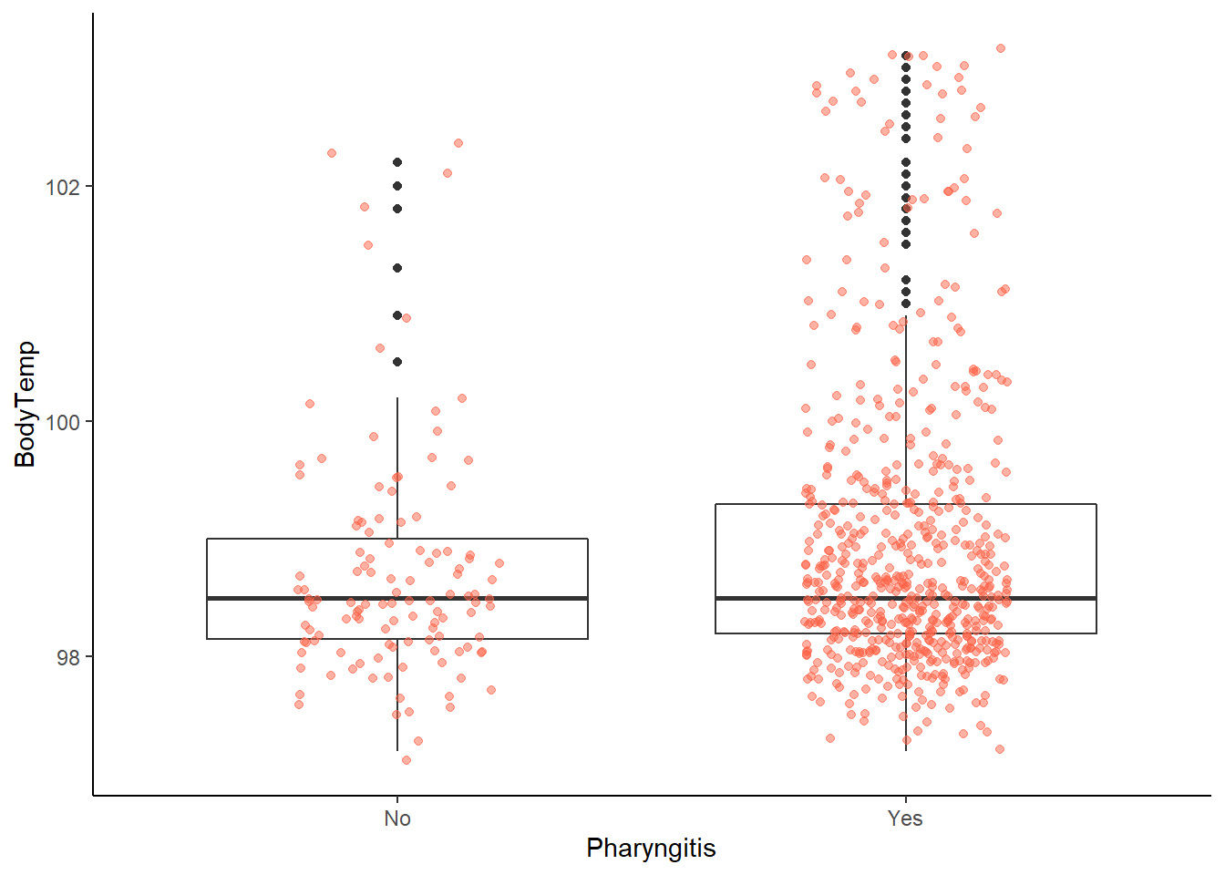
# looking at this graph, hard to tell potential difference
# likely due to totals in each group (yes = 611, no = 119)

# (3) now with nausea
# first create a table output of Pharyngitis by nausea
# we can do this using the table 1 package
table1::label(EDAdata$Pharyngitis) <- "Pharyngitis"
table1::table1(~ Pharyngitis | Nausea, data = EDAdata)
|
Nausea Absent
(N=475) |
Nausea Present
(N=255) |
Overall
(N=730) |
| Pharyngitis |
|
|
|
| No |
80 (16.8%) |
39 (15.3%) |
119 (16.3%) |
| Yes |
395 (83.2%) |
216 (84.7%) |
611 (83.7%) |
# since both are categorical variables, we can use a stacked bar plot to understand the distribution of nausea and Pharyngitis
# to be able to include the percentages within each group, we will to calculate percentages before creating a graph
# first need to define a sequential piping operator so the function knows to use objects defined in the operation
`%s>%` <- magrittr::pipe_eager_lexical

# the first part of this piping operation calculates the counts and percentages within the Nausea grouping
# the second part plots it using the ggplot2 package
# trying to visualize the proportion of Pharyngitis patients report outcome of interest (nausea)
# spacing on the labels isn't ideal, so would need to adjust for an actual manuscript
EDAdata %s>%
  dplyr::group_by(Pharyngitis, Nausea) %s>%
  dplyr::summarise(count_Nausea = n()) %s>%
  dplyr::group_by(Pharyngitis) %s>%
  dplyr::mutate(count_Pharyngitis = sum(count_Nausea)) %s>%
  dplyr::mutate(pct = count_Nausea / count_Pharyngitis) %s>% {
    ggplot2::ggplot(., aes(x = Pharyngitis,
                           y = count_Nausea,
                           fill = Nausea)) +
      ggplot2::geom_bar(
        position = "stack",
        stat = "identity") +
      ggplot2::geom_text(
        aes(label = count_Nausea),
        .,
        stat = 'identity',
        size = 4,
        position = position_stack(vjust = 0.7, reverse = FALSE)) +
      ggplot2::geom_text(
        aes(label = scales::percent(pct)),
        .,
        stat = 'identity',
        size = 4,
        position = position_stack(vjust = 0.5, reverse = FALSE)) +
      ggplot2::labs(.,
                    title = "Frequency of Nausea among Pharyngitis Patients",
                    x = "Pharyngitis?",
                    y = "Frequency of Nausea")
  }
## `summarise()` has grouped output by 'Pharyngitis'. You can override using the `.groups` argument.
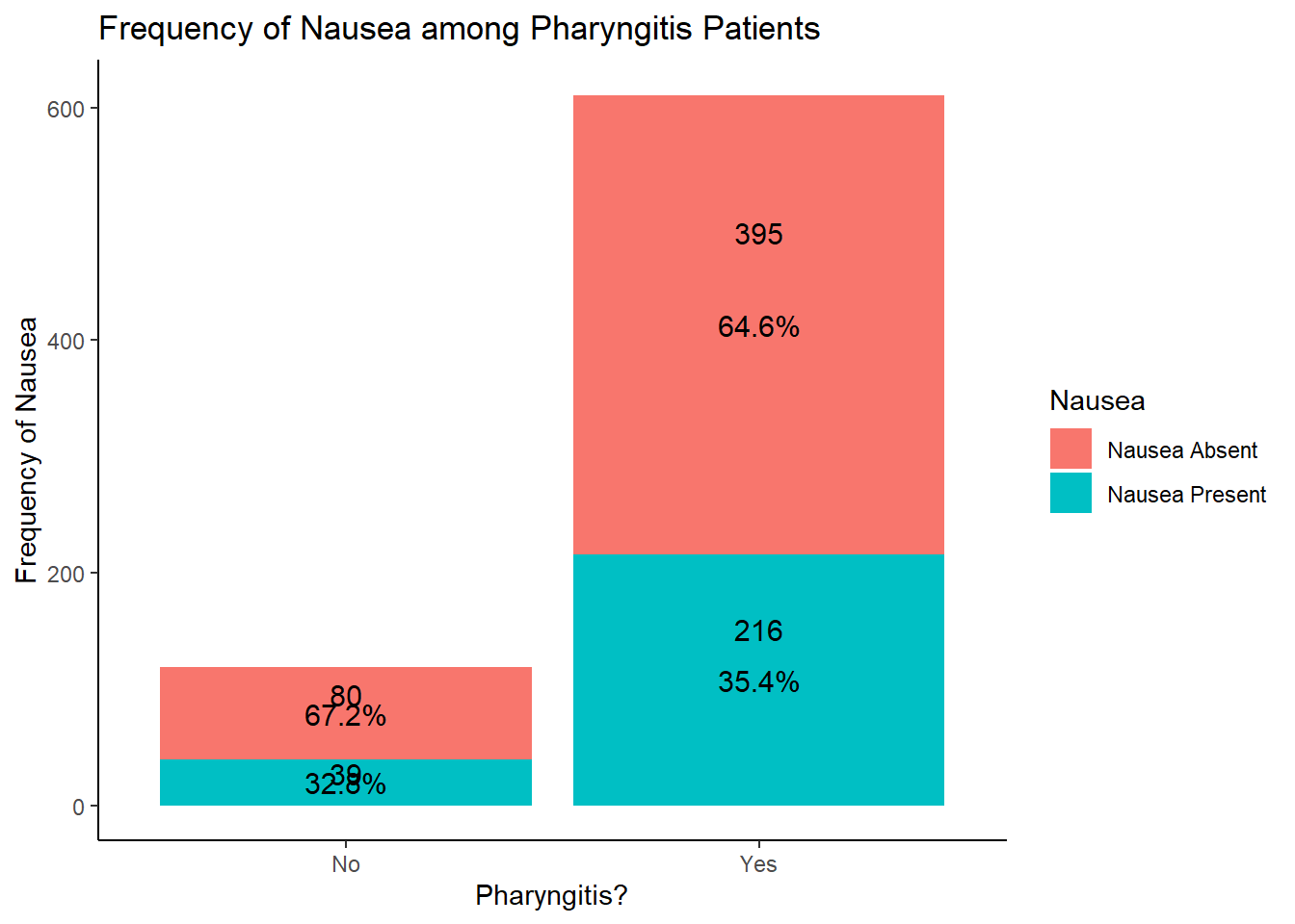
# looking at the results of this graph, hard to see any real difference
Predictor Variable: Chills / Sweating
# (1) since it is categorical, we can only examine frequency and proportions of the variable
# this can be done with the summary tools package function "freq" and options to hide NAs (removed during processing)
summarytools::freq(EDAdata$ChillsSweats, report.nas = FALSE)
## Frequencies
##
##               Freq        %   % Cum.
## ----------- ------ -------- --------
##          No    130    17.81    17.81
##         Yes    600    82.19   100.00
##       Total    730   100.00   100.00
# more than 80% of patients captured in this dataset have chills

# (2) skip as chills is not a continuous variable

# (3) examine graphical relationship with outcomes
# start with body temperature (i.e. create a box plot)
# include a jitter function to have a better idea of number of measurements and distribution
ggplot2::ggplot(data = EDAdata, aes(x = ChillsSweats, y = BodyTemp)) +
  geom_boxplot() +
  geom_jitter(alpha = 0.5, width = 0.2, height = 0.2, color = "tomato")
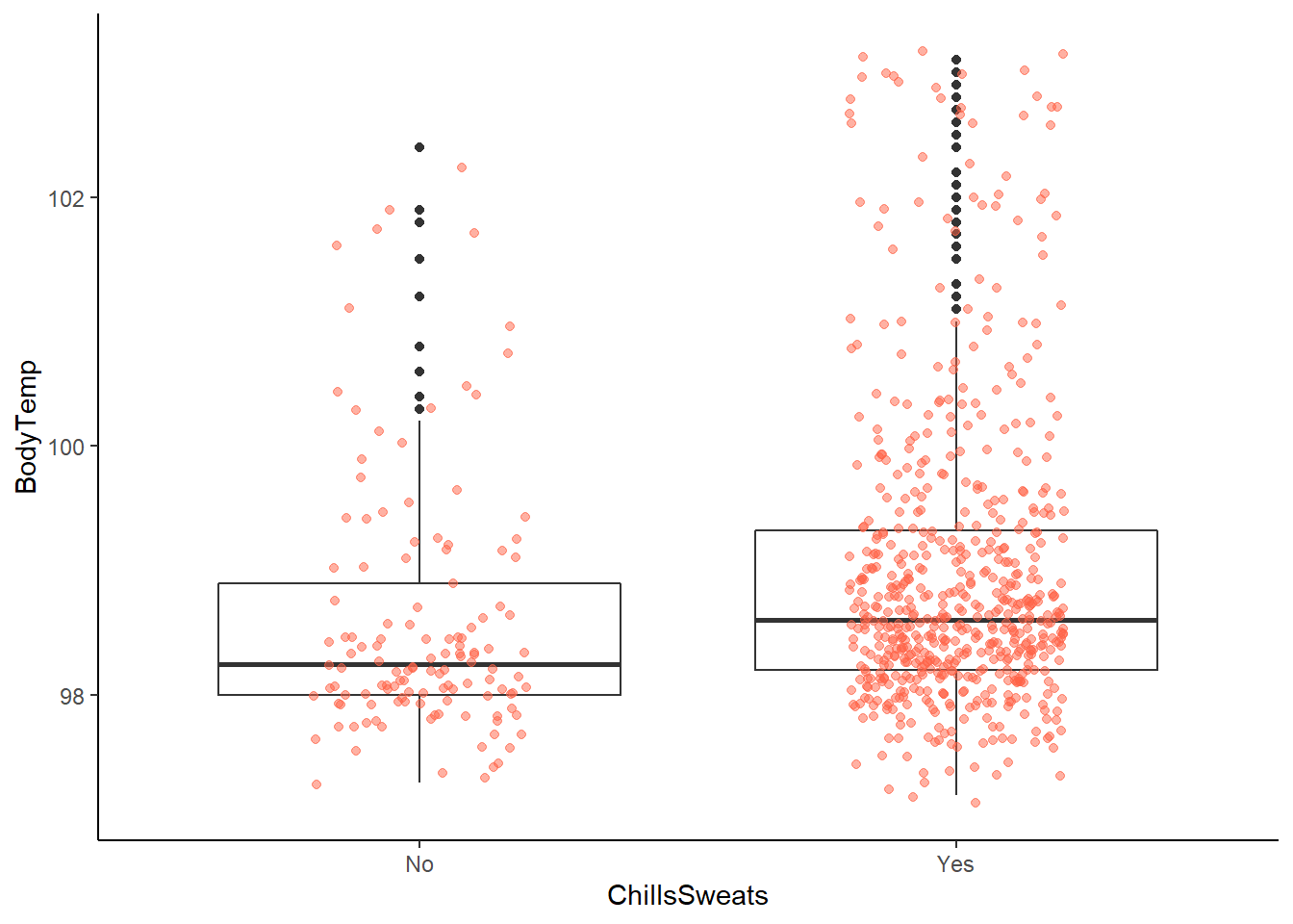
# more chills / sweats reported with higher body temperature
# this difference makes sense as chills / sweats are often the result of a fever

# (3) now with nausea
# first create a table output of chills by nausea
# we can do this using the table 1 package
table1::label(EDAdata$ChillsSweats) <- "ChillsSweats"
table1::table1(~ ChillsSweats | Nausea, data = EDAdata)
|
Nausea Absent
(N=475) |
Nausea Present
(N=255) |
Overall
(N=730) |
| ChillsSweats |
|
|
|
| No |
103 (21.7%) |
27 (10.6%) |
130 (17.8%) |
| Yes |
372 (78.3%) |
228 (89.4%) |
600 (82.2%) |
# since both are categorical variables, we can use a stacked bar plot to understand the distribution of nausea and chills
# to be able to include the percentages within each group, we will to calculate percentages before creating a graph
# first need to define a sequential piping operator so the function knows to use objects defined in the operation
`%s>%` <- magrittr::pipe_eager_lexical

# the first part of this piping operation calculates the counts and percentages within the Nausea grouping
# the second part plots it using the ggplot2 package
# trying to visualize the proportion of chills patients report outcome of interest (nausea)
# spacing on the labels isn't ideal, so would need to adjust for an actual manuscript
EDAdata %s>%
  dplyr::group_by(ChillsSweats, Nausea) %s>%
  dplyr::summarise(count_Nausea = n()) %s>%
  dplyr::group_by(ChillsSweats) %s>%
  dplyr::mutate(count_ChillsSweats = sum(count_Nausea)) %s>%
  dplyr::mutate(pct = count_Nausea / count_ChillsSweats) %s>% {
    ggplot2::ggplot(., aes(x = ChillsSweats,
                           y = count_Nausea,
                           fill = Nausea)) +
      ggplot2::geom_bar(
        position = "stack",
        stat = "identity") +
      ggplot2::geom_text(
        aes(label = count_Nausea),
        .,
        stat = 'identity',
        size = 4,
        position = position_stack(vjust = 0.7, reverse = FALSE)) +
      ggplot2::geom_text(
        aes(label = scales::percent(pct)),
        .,
        stat = 'identity',
        size = 4,
        position = position_stack(vjust = 0.5, reverse = FALSE)) +
      ggplot2::labs(.,
                    title = "Frequency of Nausea among Chills / Sweats",
                    x = "Chills or Sweats?",
                    y = "Frequency of Nausea")
  }
## `summarise()` has grouped output by 'ChillsSweats'. You can override using the `.groups` argument.
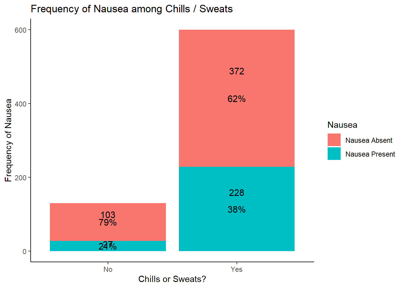
# looking at the results of this graph, potentially more nausea with chills / sweats
# requires further analysis to determine significance
Predictor Variable: Myalgia
# there are multiple variables for myalgia, but we can focus on the one that gives a severity scale of myalgia

# (1) since it is categorical, we can only examine frequency and proportions of the variable
# this can be done with the summary tools package function "freq" and options to hide NAs (removed during processing)
summarytools::freq(EDAdata$Myalgia, report.nas = FALSE)
## Frequencies
##
##                  Freq        %   % Cum.
## -------------- ------ -------- --------
##           None     79    10.82    10.82
##           Mild    213    29.18    40.00
##       Moderate    325    44.52    84.52
##         Severe    113    15.48   100.00
##          Total    730   100.00   100.00
# nearly half of the patients in the dataset reported moderate myalgia
# approximately 3/4 of the patients in the dataset reported mild or moderate myalgia

# (2) skip as myalgia is not a continuous variable

# (3) examine graphical relationship with outcomes
# start with body temperature (i.e. create a box plot)
# include a jitter function to have a better idea of number of measurements and distribution
ggplot2::ggplot(data = EDAdata, aes(x = Myalgia, y = BodyTemp)) +
  geom_boxplot() +
  geom_jitter(alpha = 0.5, width = 0.2, height = 0.2, color = "tomato")
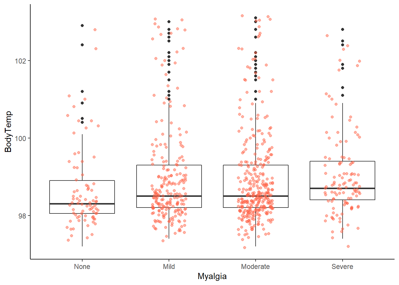
# looking at this graph, it appears that patients with no myalgia were less likely to have a fever
# it doesn't appear to have a great variation among the severity of myalgia symptoms
# but this requires further analysis

# (3) now with nausea
# first create a table output of runny nose by nausea
# we can do this using the table 1 package
table1::label(EDAdata$Myalgia) <- "Myalgia"
table1::table1(~ Myalgia | Nausea, data = EDAdata)
|
Nausea Absent
(N=475) |
Nausea Present
(N=255) |
Overall
(N=730) |
| Myalgia |
|
|
|
| None |
63 (13.3%) |
16 (6.3%) |
79 (10.8%) |
| Mild |
159 (33.5%) |
54 (21.2%) |
213 (29.2%) |
| Moderate |
198 (41.7%) |
127 (49.8%) |
325 (44.5%) |
| Severe |
55 (11.6%) |
58 (22.7%) |
113 (15.5%) |
# since both are categorical variables, we can use a stacked bar plot to understand the distribution of nausea within myalgia symptoms
# to be able to include the percentages within each group, we will to calculate percentages before creating a graph
# first need to define a sequential piping operator so the function knows to use objects defined in the operation
`%s>%` <- magrittr::pipe_eager_lexical

# the first part of this piping operation calculates the counts and percentages within the Nausea grouping
# the second part plots it using the ggplot2 package
# trying to visualize the proportion of myalgia patients report outcome of interest (nausea)
# spacing on the labels isn't ideal, so would need to adjust for an actual manuscript
EDAdata %s>%
  dplyr::group_by(Myalgia, Nausea) %s>%
  dplyr::summarise(count_Nausea = n()) %s>%
  dplyr::group_by(Myalgia) %s>%
  dplyr::mutate(count_Myalgia = sum(count_Nausea)) %s>%
  dplyr::mutate(pct = count_Nausea / count_Myalgia) %s>% {
    ggplot2::ggplot(., aes(x = Myalgia,
                           y = count_Nausea,
                           fill = Nausea)) +
      ggplot2::geom_bar(
        position = "stack",
        stat = "identity") +
      ggplot2::geom_text(
        aes(label = count_Nausea),
        .,
        stat = 'identity',
        size = 4,
        position = position_stack(vjust = 0.7, reverse = FALSE)) +
      ggplot2::geom_text(
        aes(label = scales::percent(pct)),
        .,
        stat = 'identity',
        size = 4,
        position = position_stack(vjust = 0.5, reverse = FALSE)) +
      ggplot2::labs(.,
                    title = "Frequency of Nausea among Myalgia Severity",
                    x = "Myalgia Severity",
                    y = "Frequency of Nausea")
  }
## `summarise()` has grouped output by 'Myalgia'. You can override using the `.groups` argument.
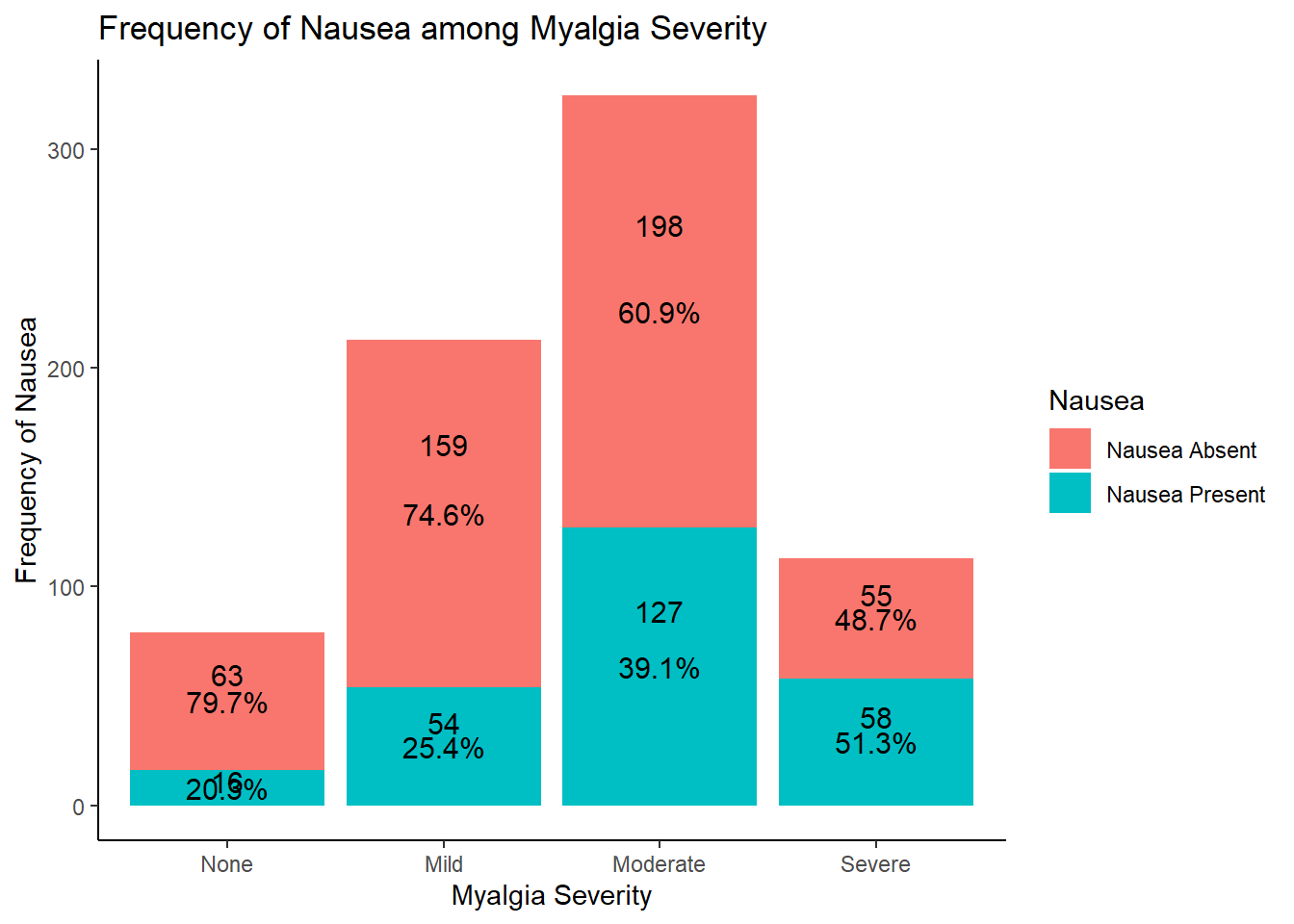
# looking at the results of this graph, it seems that increasing myalgia severity is associated with decreased nausea
# this makes sense clinically
# need further evaluation for significance
Predictor Variable: Diarrhea
# (1) since it is categorical, we can only examine frequency and proportions of the variable
# this can be done with the summary tools package function "freq" and options to hide NAs (removed during processing)
summarytools::freq(EDAdata$Diarrhea, report.nas = FALSE)
## Frequencies
##
##               Freq        %   % Cum.
## ----------- ------ -------- --------
##          No    631    86.44    86.44
##         Yes     99    13.56   100.00
##       Total    730   100.00   100.00
# more than 80% of patients captured in this dataset have Diarrhea

# (2) skip as Diarrhea is not a continuous variable

# (3) examine graphical relationship with outcomes
# start with body temperature (i.e. create a box plot)
# include a jitter function to have a better idea of number of measurements and distribution
ggplot2::ggplot(data = EDAdata, aes(x = Diarrhea, y = BodyTemp)) +
  geom_boxplot() +
  geom_jitter(alpha = 0.5, width = 0.2, height = 0.2, color = "tomato")
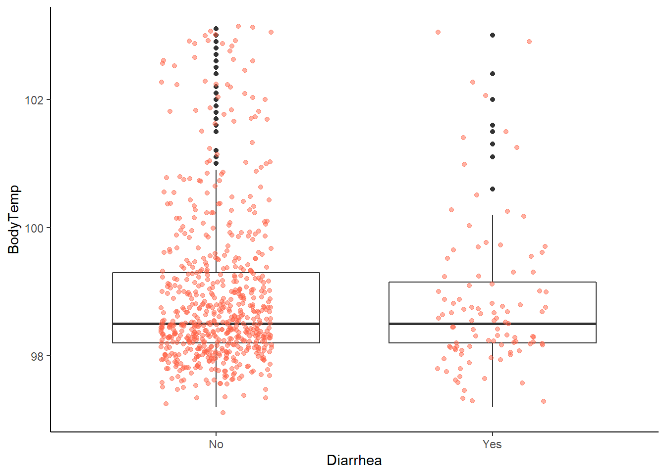
# no clear difference in body temperature

# (3) now with nausea
# first create a table output of Diarrhea by nausea
# we can do this using the table 1 package
table1::label(EDAdata$Diarrhea) <- "Diarrhea"
table1::table1(~ Diarrhea | Nausea, data = EDAdata)
|
Nausea Absent
(N=475) |
Nausea Present
(N=255) |
Overall
(N=730) |
| Diarrhea |
|
|
|
| No |
435 (91.6%) |
196 (76.9%) |
631 (86.4%) |
| Yes |
40 (8.4%) |
59 (23.1%) |
99 (13.6%) |
# since both are categorical variables, we can use a stacked bar plot to understand the distribution of nausea and Diarrhea
# to be able to include the percentages within each group, we will to calculate percentages before creating a graph
# first need to define a sequential piping operator so the function knows to use objects defined in the operation
`%s>%` <- magrittr::pipe_eager_lexical

# the first part of this piping operation calculates the counts and percentages within the Nausea grouping
# the second part plots it using the ggplot2 package
# trying to visualize the proportion of Diarrhea patients report outcome of interest (nausea)
# spacing on the labels isn't ideal, so would need to adjust for an actual manuscript
EDAdata %s>%
  dplyr::group_by(Diarrhea, Nausea) %s>%
  dplyr::summarise(count_Nausea = n()) %s>%
  dplyr::group_by(Diarrhea) %s>%
  dplyr::mutate(count_Diarrhea = sum(count_Nausea)) %s>%
  dplyr::mutate(pct = count_Nausea / count_Diarrhea) %s>% {
    ggplot2::ggplot(., aes(x = Diarrhea,
                           y = count_Nausea,
                           fill = Nausea)) +
      ggplot2::geom_bar(
        position = "stack",
        stat = "identity") +
      ggplot2::geom_text(
        aes(label = count_Nausea),
        .,
        stat = 'identity',
        size = 4,
        position = position_stack(vjust = 0.7, reverse = FALSE)) +
      ggplot2::geom_text(
        aes(label = scales::percent(pct)),
        .,
        stat = 'identity',
        size = 4,
        position = position_stack(vjust = 0.5, reverse = FALSE)) +
      ggplot2::labs(.,
                    title = "Frequency of Nausea among Diarrhea",
                    x = "Diarrhea?",
                    y = "Frequency of Nausea")
  }
## `summarise()` has grouped output by 'Diarrhea'. You can override using the `.groups` argument.
# based on the results, it appears that more patients with diarrhea had nausea
# this makes sense clinically as nausea and diarrhea often co-present
Predictor Variable: Vomitting
# (1) since it is categorical, we can only examine frequency and proportions of the variable
# this can be done with the summary tools package function "freq" and options to hide NAs (removed during processing)
summarytools::freq(EDAdata$Vomit, report.nas = FALSE)
## Frequencies
##
##               Freq        %   % Cum.
## ----------- ------ -------- --------
##          No    652    89.32    89.32
##         Yes     78    10.68   100.00
##       Total    730   100.00   100.00
# more than 80% of patients captured in this dataset report vomiting

# (2) skip as Vomit is not a continuous variable

# (3) examine graphical relationship with outcomes
# start with body temperature (i.e. create a box plot)
# include a jitter function to have a better idea of number of measurements and distribution
ggplot2::ggplot(data = EDAdata, aes(x = Vomit, y = BodyTemp)) +
  geom_boxplot() +
  geom_jitter(alpha = 0.5, width = 0.2, height = 0.2, color = "tomato")
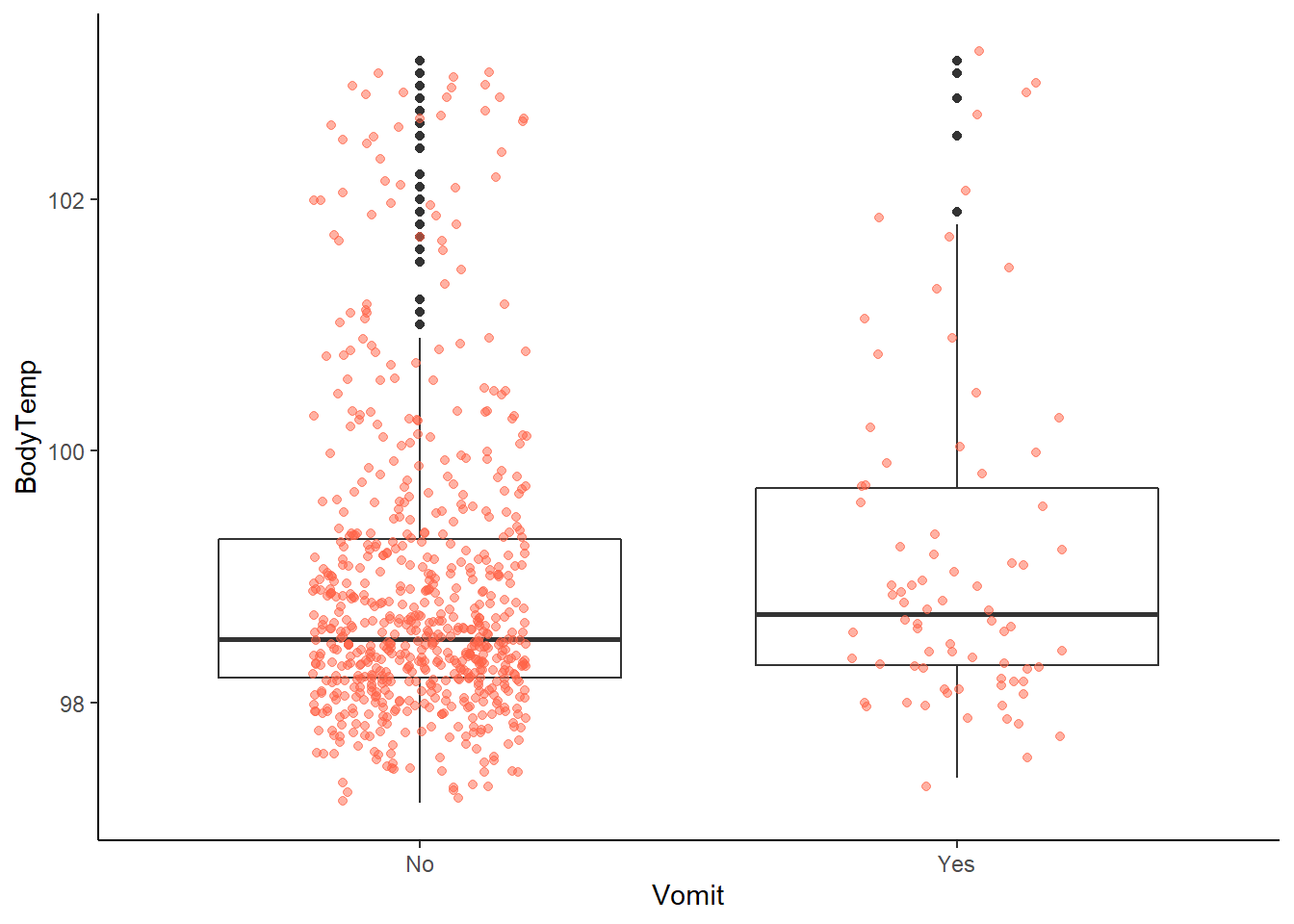
# most obviously far fewer patients reporting vomiting
# but, potentially associated with an increased body temperature

# (3) now with nausea
# first create a table output of Vomit by nausea
# we can do this using the table 1 package
table1::label(EDAdata$Vomit) <- "Vomit"
table1::table1(~ Vomit | Nausea, data = EDAdata)
|
Nausea Absent
(N=475) |
Nausea Present
(N=255) |
Overall
(N=730) |
| Vomit |
|
|
|
| No |
461 (97.1%) |
191 (74.9%) |
652 (89.3%) |
| Yes |
14 (2.9%) |
64 (25.1%) |
78 (10.7%) |
# since both are categorical variables, we can use a stacked bar plot to understand the distribution of nausea and vomiting
# to be able to include the percentages within each group, we will to calculate percentages before creating a graph
# first need to define a sequential piping operator so the function knows to use objects defined in the operation
`%s>%` <- magrittr::pipe_eager_lexical

# the first part of this piping operation calculates the counts and percentages within the Nausea grouping
# the second part plots it using the ggplot2 package
# trying to visualize the proportion of vomiting patients report outcome of interest (nausea)
# spacing on the labels isn't ideal, so would need to adjust for an actual manuscript
EDAdata %s>%
  dplyr::group_by(Vomit, Nausea) %s>%
  dplyr::summarise(count_Nausea = n()) %s>%
  dplyr::group_by(Vomit) %s>%
  dplyr::mutate(count_Vomit = sum(count_Nausea)) %s>%
  dplyr::mutate(pct = count_Nausea / count_Vomit) %s>% {
    ggplot2::ggplot(., aes(x = Vomit,
                           y = count_Nausea,
                           fill = Nausea)) +
      ggplot2::geom_bar(
        position = "stack",
        stat = "identity") +
      ggplot2::geom_text(
        aes(label = count_Nausea),
        .,
        stat = 'identity',
        size = 4,
        position = position_stack(vjust = 0.7, reverse = FALSE)) +
      ggplot2::geom_text(
        aes(label = scales::percent(pct)),
        .,
        stat = 'identity',
        size = 4,
        position = position_stack(vjust = 0.5, reverse = FALSE)) +
      ggplot2::labs(.,
                    title = "Frequency of Nausea among Vomiting",
                    x = "Vomiting?",
                    y = "Frequency of Nausea")
  }
## `summarise()` has grouped output by 'Vomit'. You can override using the `.groups` argument.
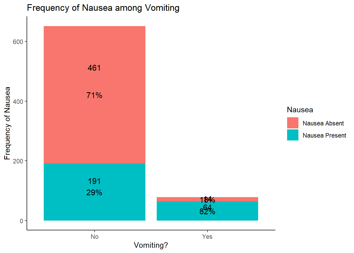
# based on the results, it appears that more patients with vomiting had nausea
# this makes sense clinically as nausea and vomiting often co-present
Creating A “Table 1” For Categorical Outcome of Interest (Nausea)
Often the first table of a manuscript lists the predictors on each row with columns representing the outcome in question. The table1 package works extremely well for categorical variables.
# first, create the summary statistics within the Table1 package for predictor variables
# already created earlier, but placed here for reference
table1::label(EDAdata$RunnyNose) <- "Runny Nose"
table1::label(EDAdata$Pharyngitis) <- "Pharyngitis"
table1::label(EDAdata$NasalCongestion) <- "Nasal Congestion"
table1::label(EDAdata$CoughIntensity) <- "Cough Intensity"
table1::label(EDAdata$ChillsSweats) <- "Chills / Sweating"
table1::label(EDAdata$Myalgia) <- "Myalgia"
table1::label(EDAdata$Vomit) <- "Vomit"
table1::label(EDAdata$Diarrhea) <- "Diarrhea"

# now, load all into a table 1 where columns represent nausea categories
table1::table1(~ RunnyNose + Pharyngitis + NasalCongestion + CoughIntensity + ChillsSweats + Myalgia + Vomit + Diarrhea
               | Nausea, data = EDAdata)
|
Nausea Absent
(N=475) |
Nausea Present
(N=255) |
Overall
(N=730) |
| Runny Nose |
|
|
|
| No |
139 (29.3%) |
72 (28.2%) |
211 (28.9%) |
| Yes |
336 (70.7%) |
183 (71.8%) |
519 (71.1%) |
| Pharyngitis |
|
|
|
| No |
80 (16.8%) |
39 (15.3%) |
119 (16.3%) |
| Yes |
395 (83.2%) |
216 (84.7%) |
611 (83.7%) |
| Nasal Congestion |
|
|
|
| No |
120 (25.3%) |
47 (18.4%) |
167 (22.9%) |
| Yes |
355 (74.7%) |
208 (81.6%) |
563 (77.1%) |
| Cough Intensity |
|
|
|
| None |
30 (6.3%) |
17 (6.7%) |
47 (6.4%) |
| Mild |
99 (20.8%) |
55 (21.6%) |
154 (21.1%) |
| Moderate |
232 (48.8%) |
125 (49.0%) |
357 (48.9%) |
| Severe |
114 (24.0%) |
58 (22.7%) |
172 (23.6%) |
| Chills / Sweating |
|
|
|
| No |
103 (21.7%) |
27 (10.6%) |
130 (17.8%) |
| Yes |
372 (78.3%) |
228 (89.4%) |
600 (82.2%) |
| Myalgia |
|
|
|
| None |
63 (13.3%) |
16 (6.3%) |
79 (10.8%) |
| Mild |
159 (33.5%) |
54 (21.2%) |
213 (29.2%) |
| Moderate |
198 (41.7%) |
127 (49.8%) |
325 (44.5%) |
| Severe |
55 (11.6%) |
58 (22.7%) |
113 (15.5%) |
| Vomit |
|
|
|
| No |
461 (97.1%) |
191 (74.9%) |
652 (89.3%) |
| Yes |
14 (2.9%) |
64 (25.1%) |
78 (10.7%) |
| Diarrhea |
|
|
|
| No |
435 (91.6%) |
196 (76.9%) |
631 (86.4%) |
| Yes |
40 (8.4%) |
59 (23.1%) |
99 (13.6%) |
# in a real analysis, we could also use this table for our univariate analysis, so we could conduct a chi-square test
# to test for differences in each variable across the Nausea strata.